Mar 26, 2024
Enhanced tools for data-driven design: Frames X v2.3
What's new in Frames X UI Kit v2.3

Hey there! We are excited to share the release of Frames X 2.3.
This major update introduces new UI components, layouts, and a brand-new local variables structure.
This release focuses on improving your work with complex data-driven designs, such as dashboards and table-based designs.
The new version introduces a more granular way of structuring component variants. With the new approach aims to help you operate and update variant sets faster and optimize the memory usage of the library.
New variables structure and updated documentation
We've moved the Spacing variable collection out of the Theme collection. Spacing variables are now a standalone Sizing collection that includes Compact and Spacious modes.
Note: We've readjusted the scoping of variables, making only the correct variables appear on the canvas elements.
We've also updated our variables documentation with more details and use-case examples to help you avoid communication gaps when sharing your variables-powered design with colleagues.
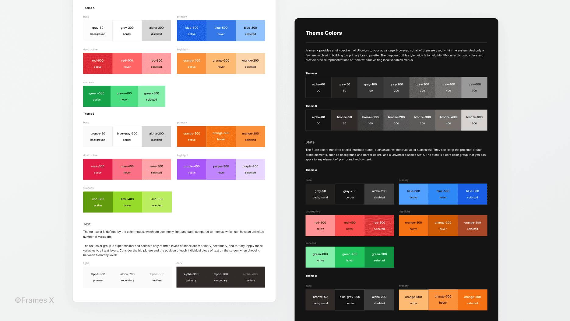
New color style guide
We've added a new color guide to help visualize the color variables used in the current Themes (Theme A and Theme B).
This new piece of documentation aims to help communicate the currently used colors in your project. Feel free to share it with your team to explain how the 'Colors in Use' are different from other available colors in your project.
We hope that the new style guide can help see the bigger picture without explaining how to navigate and use local variables to every person involved in the project.
Note: You can find the new 'Colors in Use' style guide on the Colors page of the file.
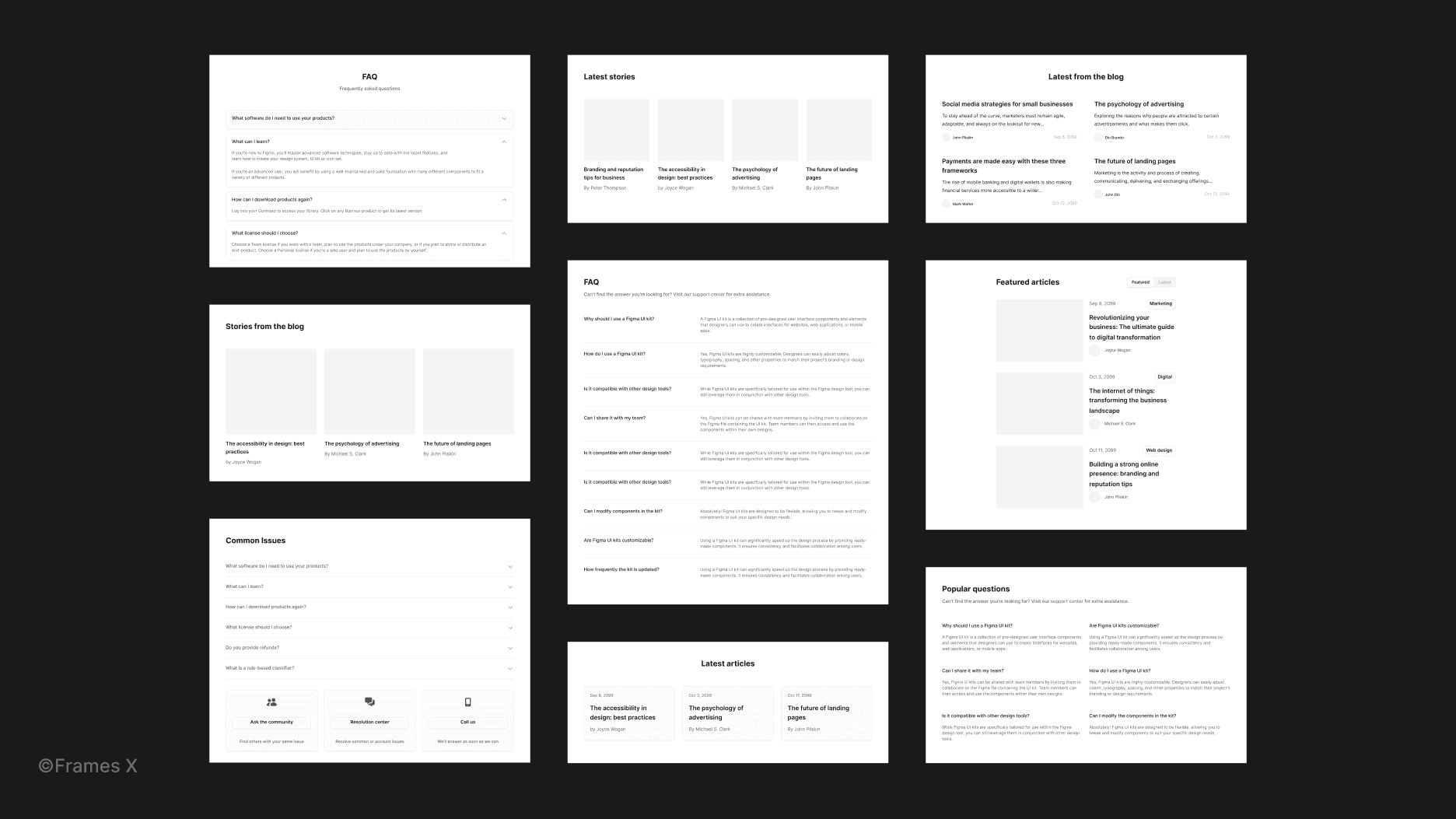
New website layouts and improvements to the site builder component
We've added 48 new responsive layouts in the Blog and FAQ categories. We've also redesigned Features, Social Proof, and Hero section layouts with new elements, better resizing, and improved variables support.
New widget component
We've added 51 highly customizable widgets. New widget components aim to display complex data from multiple sources in a compact card view that can be added to a dashboard or your web application project.
Note: All widgets are made with predefined controls and provide support for multiple sizes utilizing variants and variables. See how you can operate the new widget and new features in Figma.
Updated templates and new sales dashboard
We've added a new Sales dashboard and significantly revamped previously added layouts utilizing new components, widgets, and variables. We've revamped the Repository, Reports, Analytics, Kanban, Account, Settings, and File Manager templates.
You can expect these freshly updated dashboards to be even more responsive and functional.
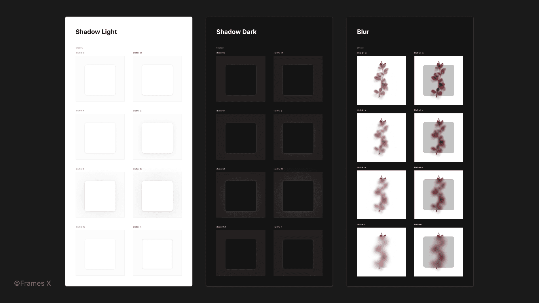
Updated shadow styles
We've updated our Shadow styles to support new opacity-based colors (Alpha variables), as well as added Blur variables, which are helpful in adjusting the elevation of shadows in UI design.
Note: Shadow styles will now adapt to the Color mode they are currently in. However, if you prefer to remove shadows from dark mode, you can turn off this behavior by removing the opacity variable from the styles adjust menu.
Updated UI components
We've updated our variant sets with a better, more granular segmentation. We've partitioned our biggest variant sets into more compact, manageable sets, allowing for more comfortable customization and adoption. Tabs, Menus, Dropdowns, and Modals now include partitioned, better-structured variants.
We've also reworked all the tables in the file and removed unused instances from table cells, making the table design experience run smoother.
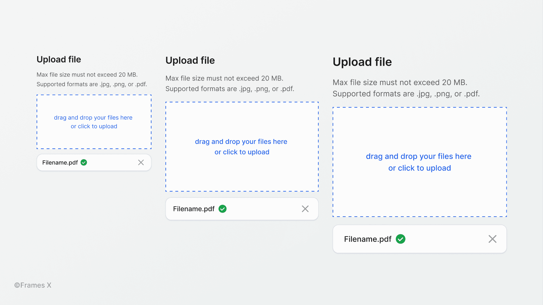
New file uploader component
We've added a new File uploader component to help integrate file upload functionality into your project's UI and other system components. The Uploader components include multiple sizes and states to display the status of uploading progress.
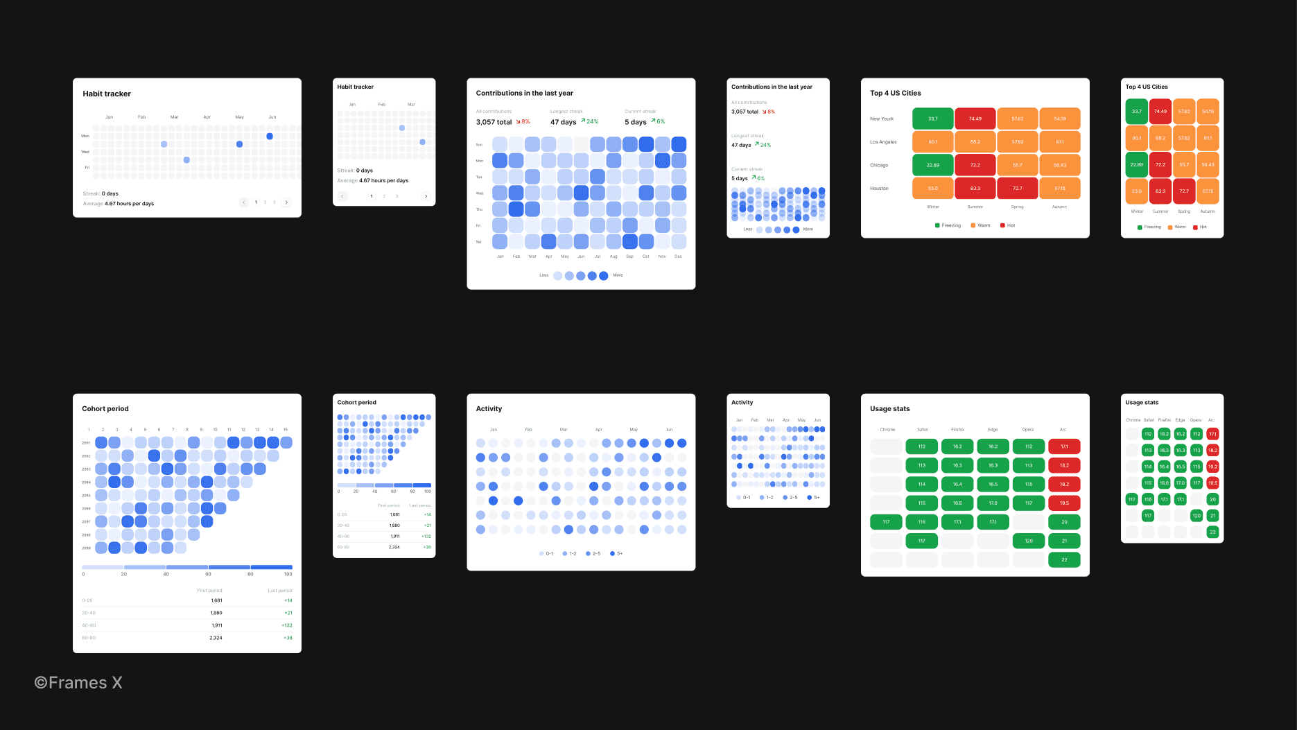
New heatmap charts
We've added 12 new Scatter charts to enrich your design with resizable diagram templates.
A heatmap is a graphical representation of data that uses color coding to represent different values and analytics. More saturated colors usually represent higher volumes of values compared to less saturated colors.
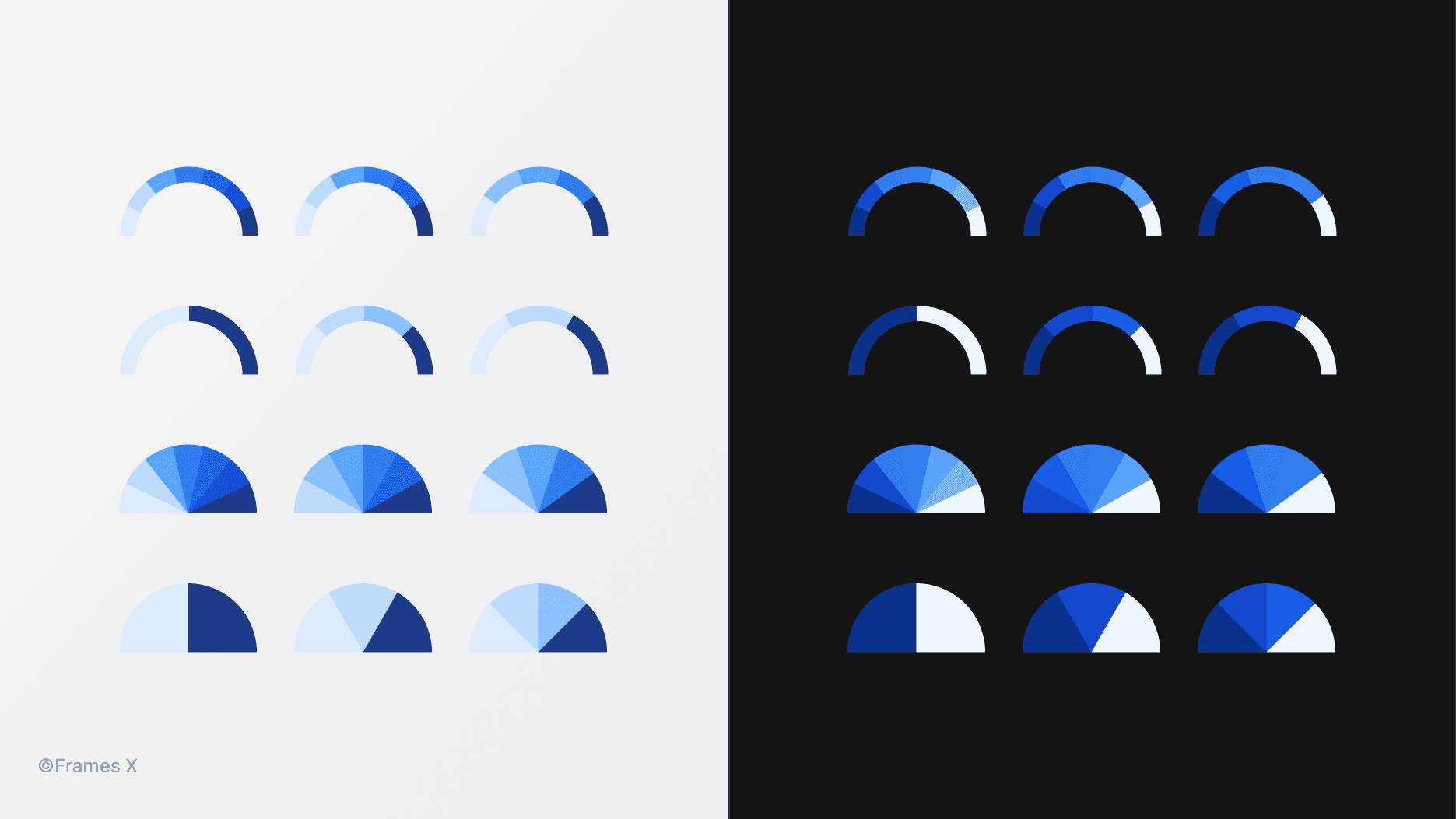
New semi-circular charts
We've updated our Charts component and have added new variants to pie and donut charts with new semi-circular diagrams to enrich your designs with more data visualization options.
Hey there! We are excited to share the release of Frames X 2.3.
This major update introduces new UI components, layouts, and a brand-new local variables structure.
This release focuses on improving your work with complex data-driven designs, such as dashboards and table-based designs.
The new version introduces a more granular way of structuring component variants. With the new approach aims to help you operate and update variant sets faster and optimize the memory usage of the library.
New variables structure and updated documentation
We've moved the Spacing variable collection out of the Theme collection. Spacing variables are now a standalone Sizing collection that includes Compact and Spacious modes.
Note: We've readjusted the scoping of variables, making only the correct variables appear on the canvas elements.
We've also updated our variables documentation with more details and use-case examples to help you avoid communication gaps when sharing your variables-powered design with colleagues.
New color style guide
We've added a new color guide to help visualize the color variables used in the current Themes (Theme A and Theme B).
This new piece of documentation aims to help communicate the currently used colors in your project. Feel free to share it with your team to explain how the 'Colors in Use' are different from other available colors in your project.
We hope that the new style guide can help see the bigger picture without explaining how to navigate and use local variables to every person involved in the project.
Note: You can find the new 'Colors in Use' style guide on the Colors page of the file.
New website layouts and improvements to the site builder component
We've added 48 new responsive layouts in the Blog and FAQ categories. We've also redesigned Features, Social Proof, and Hero section layouts with new elements, better resizing, and improved variables support.
New widget component
We've added 51 highly customizable widgets. New widget components aim to display complex data from multiple sources in a compact card view that can be added to a dashboard or your web application project.
Note: All widgets are made with predefined controls and provide support for multiple sizes utilizing variants and variables. See how you can operate the new widget and new features in Figma.
Updated templates and new sales dashboard
We've added a new Sales dashboard and significantly revamped previously added layouts utilizing new components, widgets, and variables. We've revamped the Repository, Reports, Analytics, Kanban, Account, Settings, and File Manager templates.
You can expect these freshly updated dashboards to be even more responsive and functional.
Updated shadow styles
We've updated our Shadow styles to support new opacity-based colors (Alpha variables), as well as added Blur variables, which are helpful in adjusting the elevation of shadows in UI design.
Note: Shadow styles will now adapt to the Color mode they are currently in. However, if you prefer to remove shadows from dark mode, you can turn off this behavior by removing the opacity variable from the styles adjust menu.
Updated UI components
We've updated our variant sets with a better, more granular segmentation. We've partitioned our biggest variant sets into more compact, manageable sets, allowing for more comfortable customization and adoption. Tabs, Menus, Dropdowns, and Modals now include partitioned, better-structured variants.
We've also reworked all the tables in the file and removed unused instances from table cells, making the table design experience run smoother.
New file uploader component
We've added a new File uploader component to help integrate file upload functionality into your project's UI and other system components. The Uploader components include multiple sizes and states to display the status of uploading progress.
New heatmap charts
We've added 12 new Scatter charts to enrich your design with resizable diagram templates.
A heatmap is a graphical representation of data that uses color coding to represent different values and analytics. More saturated colors usually represent higher volumes of values compared to less saturated colors.
New semi-circular charts
We've updated our Charts component and have added new variants to pie and donut charts with new semi-circular diagrams to enrich your designs with more data visualization options.
⟡
⟡
⟡
Frames X is the most extensive and advanced UI library to exist for Figma. If you haven't already, get the Frames X now to receive all future updates and enhance your design workflow — complete design projects faster and get paid more.
See you in the next update!