Apr 26, 2024
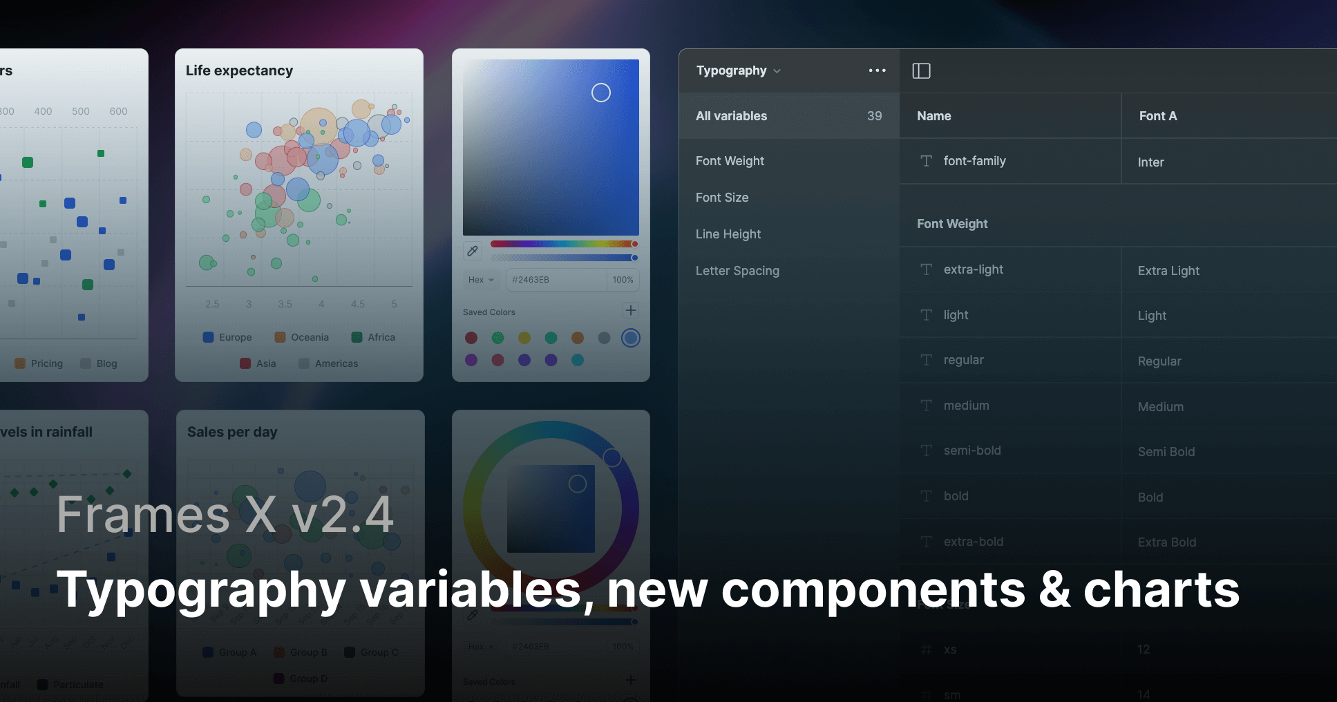
Typography variables, new components & charts: Frames X v2.4
What's new in Frames X UI Kit v2.4
Hey there! We are excited to share the release of Frames X 2.4!
This update introduces long-awaited Typography variables, new components, and responsive charts. It focuses on elevating your workflow with text and widens the UI toolset with new features and data visualization elements.
The new release also includes a major improvement to file performance, reducing the memory usage of our UI kit.
New typography variables in Figma
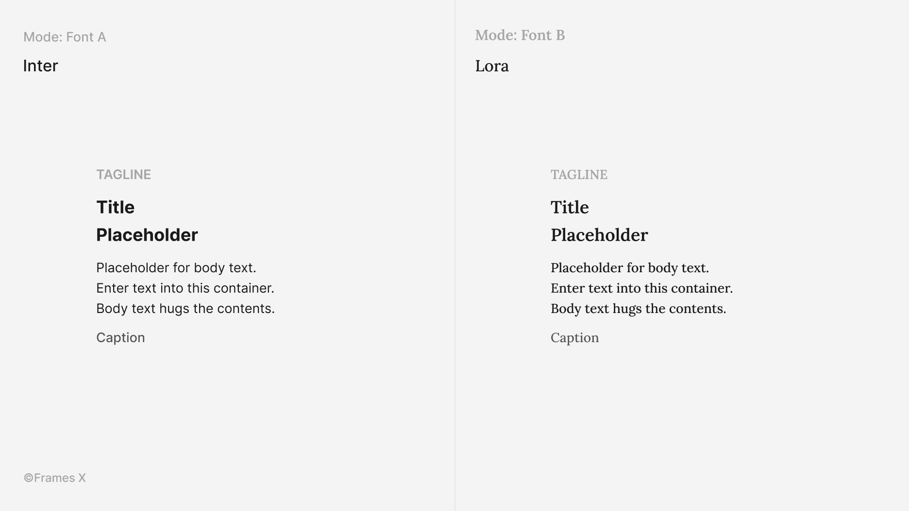
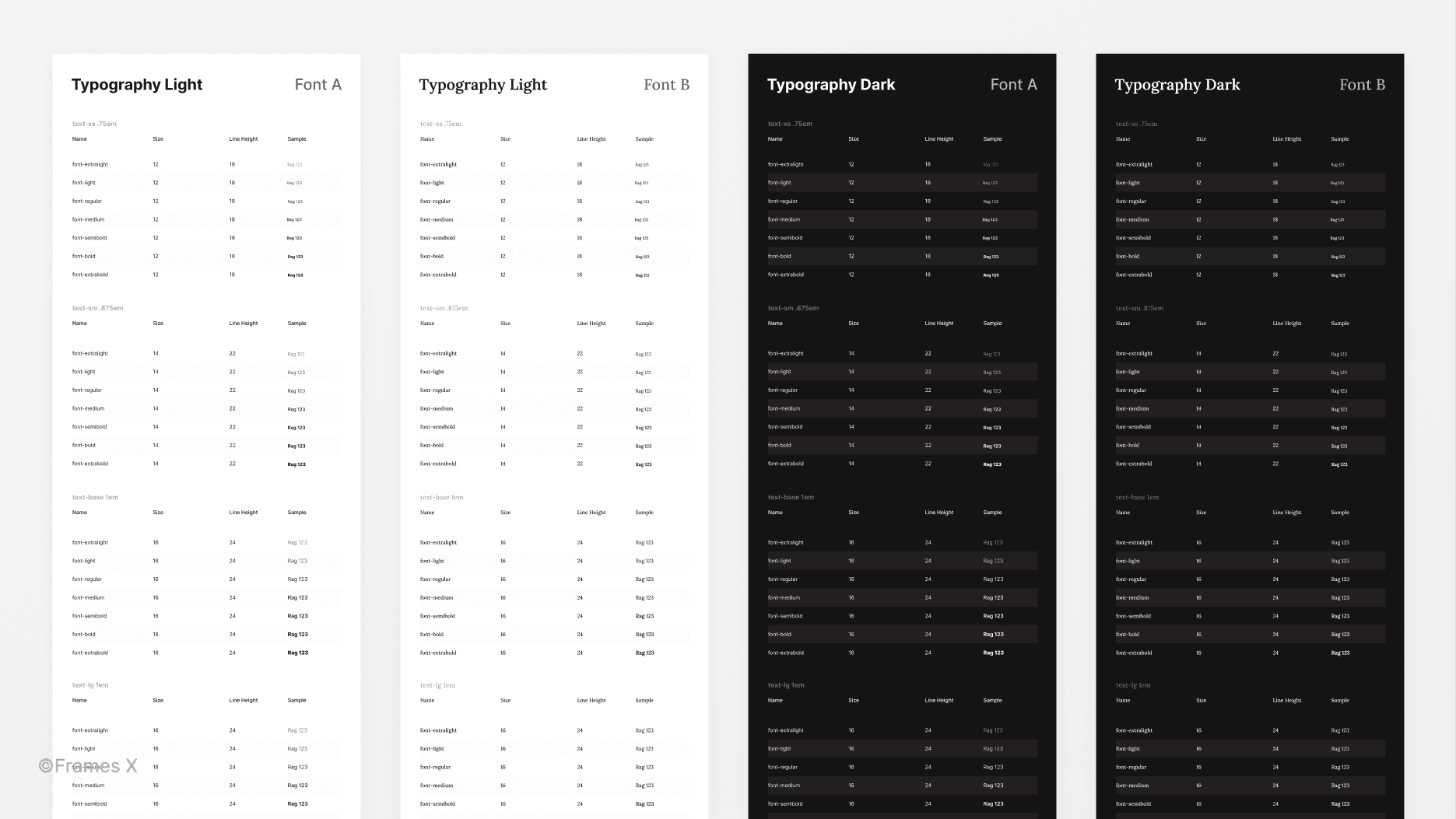
We've added a new Typography variables collection that includes groups for defining global text parameters, such as font size, line height, font width, and letter spacing.
With these new typography variables, you can precisely control every text style applied to your projects since all of them are bound to these global parameters. What's more, you can now use Fonts as separate modes to switch from using one font to another.
Note: As a second system font, we've chosen Lora, a memorable serif font that is available for free from Google Fonts.
We've implemented text variables as separate collection of primitives to improve the consistency of your work without breaking your current workflow around text styles. We've also updated the typography guidelines page and removed redundant text styles such as thin (3xl-light) and black (3xl-bold).
Note: Before working with the UI kit's new typography, we recommend checking this official video for extra insights on new text variables.
→ See the new text variables in action
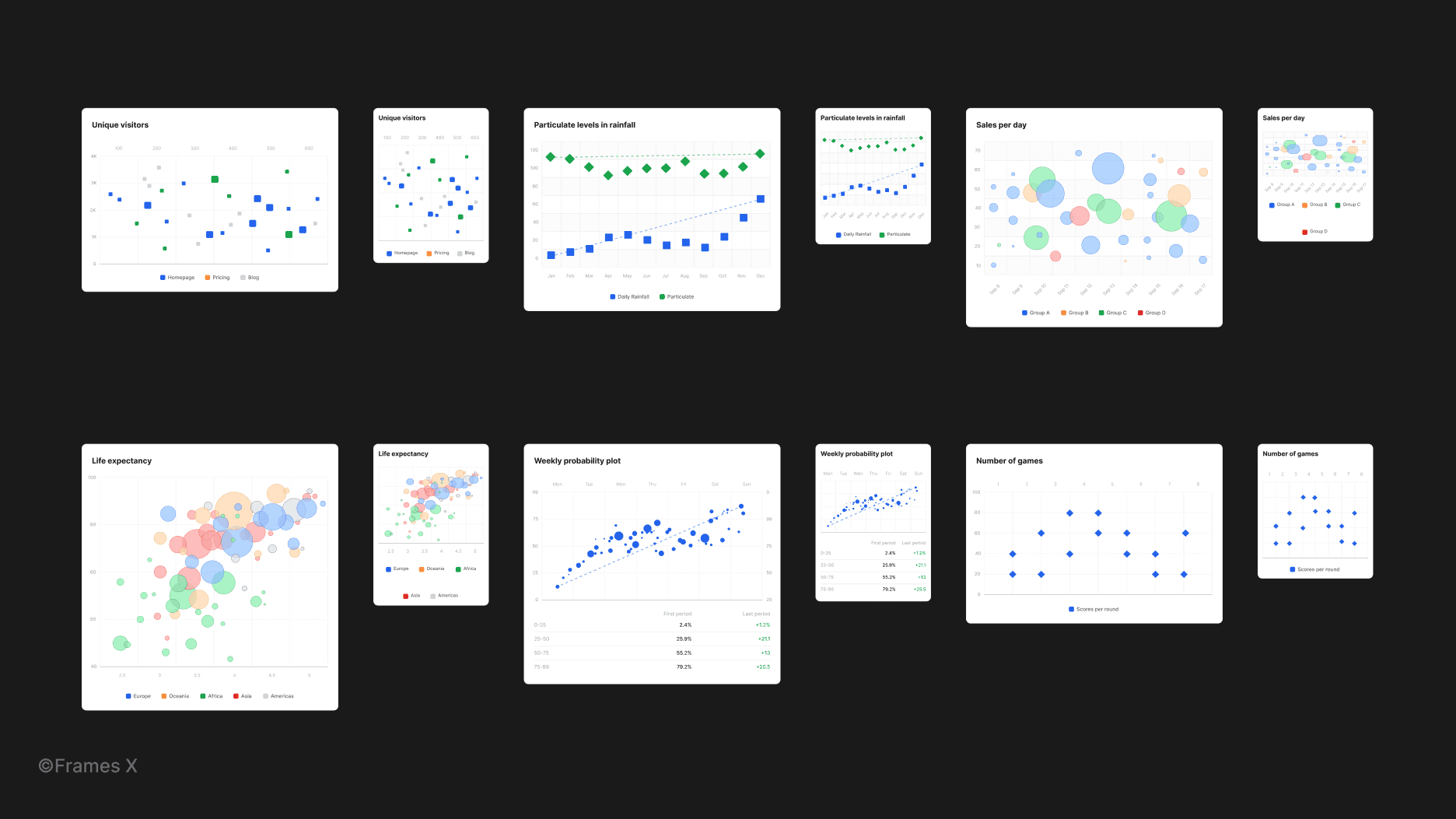
New scatter charts
We've added 12 new Scatter charts to enrich your project designs with fully resizable scatter plot diagrams.
Scatter plots are commonly used graphs to show the dynamic relationship between two numeric values (X vs. Y). They can be used in your analytics or dashboard designs as a solid, responsive layout.
→ See new scatter charts in action
New UI components
This release has added several UI components, including a Color Picker, Counter Input, Floating Popover, and Text Editor (WYSIWYG).
These components are specified for designing rich application UI and can be handy for creating text and image editing interfaces and applications. All newly added components are documented with their intended purpose and have variable modes attached for quick adoption and customization.
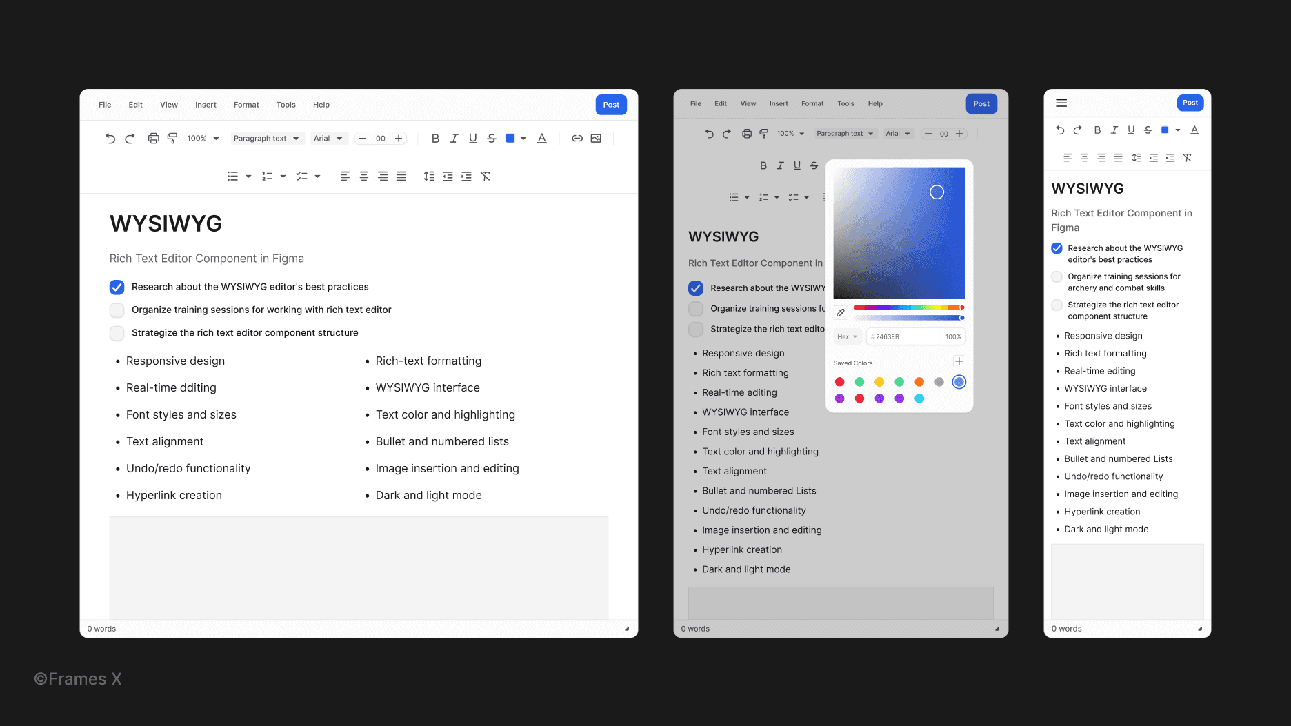
→ See new rich text editor component in action
Updated UI components
We've updated and extended several component sets, including Toggles, Radios, Checkboxes, and Dropdown components.
We've added extra variants to support more component sizes and help them adapt to different states/display sizes of your project UI.
Updated Interactive components
We've polished our component interactions and added new ones to the interactive playground.
We've added new interactions to commonly used control elements, including Text buttons, Checkbox buttons, Radio buttons, Outline inputs, and Material inputs. You can find the new interaction examples on the Interactive Components page in Figma's Frames X file.
→ See new component interactions
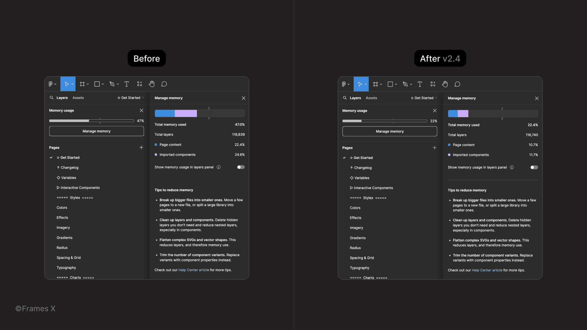
Memory usage improvements
We have significantly reduced the memory usage of Frames X's file by removing the previous version history and all previously published "ghost" layers/components. As a result, you can expect a smoother experience when working with any file's contents.
Hey there! We are excited to share the release of Frames X 2.4!
This update introduces long-awaited Typography variables, new components, and responsive charts. It focuses on elevating your workflow with text and widens the UI toolset with new features and data visualization elements.
The new release also includes a major improvement to file performance, reducing the memory usage of our UI kit.
New typography variables in Figma
We've added a new Typography variables collection that includes groups for defining global text parameters, such as font size, line height, font width, and letter spacing.
With these new typography variables, you can precisely control every text style applied to your projects since all of them are bound to these global parameters. What's more, you can now use Fonts as separate modes to switch from using one font to another.
Note: As a second system font, we've chosen Lora, a memorable serif font that is available for free from Google Fonts.
We've implemented text variables as separate collection of primitives to improve the consistency of your work without breaking your current workflow around text styles. We've also updated the typography guidelines page and removed redundant text styles such as thin (3xl-light) and black (3xl-bold).
Note: Before working with the UI kit's new typography, we recommend checking this official video for extra insights on new text variables.
→ See the new text variables in action
New scatter charts
We've added 12 new Scatter charts to enrich your project designs with fully resizable scatter plot diagrams.
Scatter plots are commonly used graphs to show the dynamic relationship between two numeric values (X vs. Y). They can be used in your analytics or dashboard designs as a solid, responsive layout.
→ See new scatter charts in action
New UI components
This release has added several UI components, including a Color Picker, Counter Input, Floating Popover, and Text Editor (WYSIWYG).
These components are specified for designing rich application UI and can be handy for creating text and image editing interfaces and applications. All newly added components are documented with their intended purpose and have variable modes attached for quick adoption and customization.
→ See new rich text editor component in action
Updated UI components
We've updated and extended several component sets, including Toggles, Radios, Checkboxes, and Dropdown components.
We've added extra variants to support more component sizes and help them adapt to different states/display sizes of your project UI.
Updated Interactive components
We've polished our component interactions and added new ones to the interactive playground.
We've added new interactions to commonly used control elements, including Text buttons, Checkbox buttons, Radio buttons, Outline inputs, and Material inputs. You can find the new interaction examples on the Interactive Components page in Figma's Frames X file.
→ See new component interactions
Memory usage improvements
We have significantly reduced the memory usage of Frames X's file by removing the previous version history and all previously published "ghost" layers/components. As a result, you can expect a smoother experience when working with any file's contents.
⟡
⟡
⟡
Frames X is the most extensive and advanced UI library to exist for Figma. If you haven't already, get the Frames X now to receive all future updates and enhance your design workflow — complete design projects faster and get paid more.
See you in the next update!