Jan 19, 2024
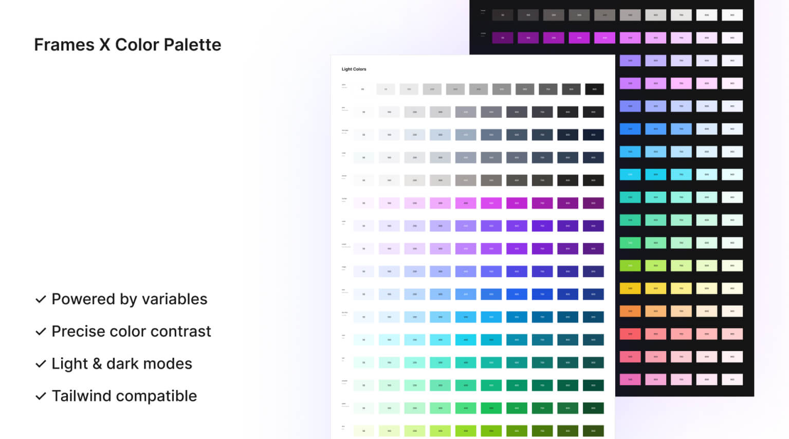
Frames X Color System: Best practices for colors in Figma
How to use Frames X's open-source color palette for UI design
Intro to Frames X's UI color system
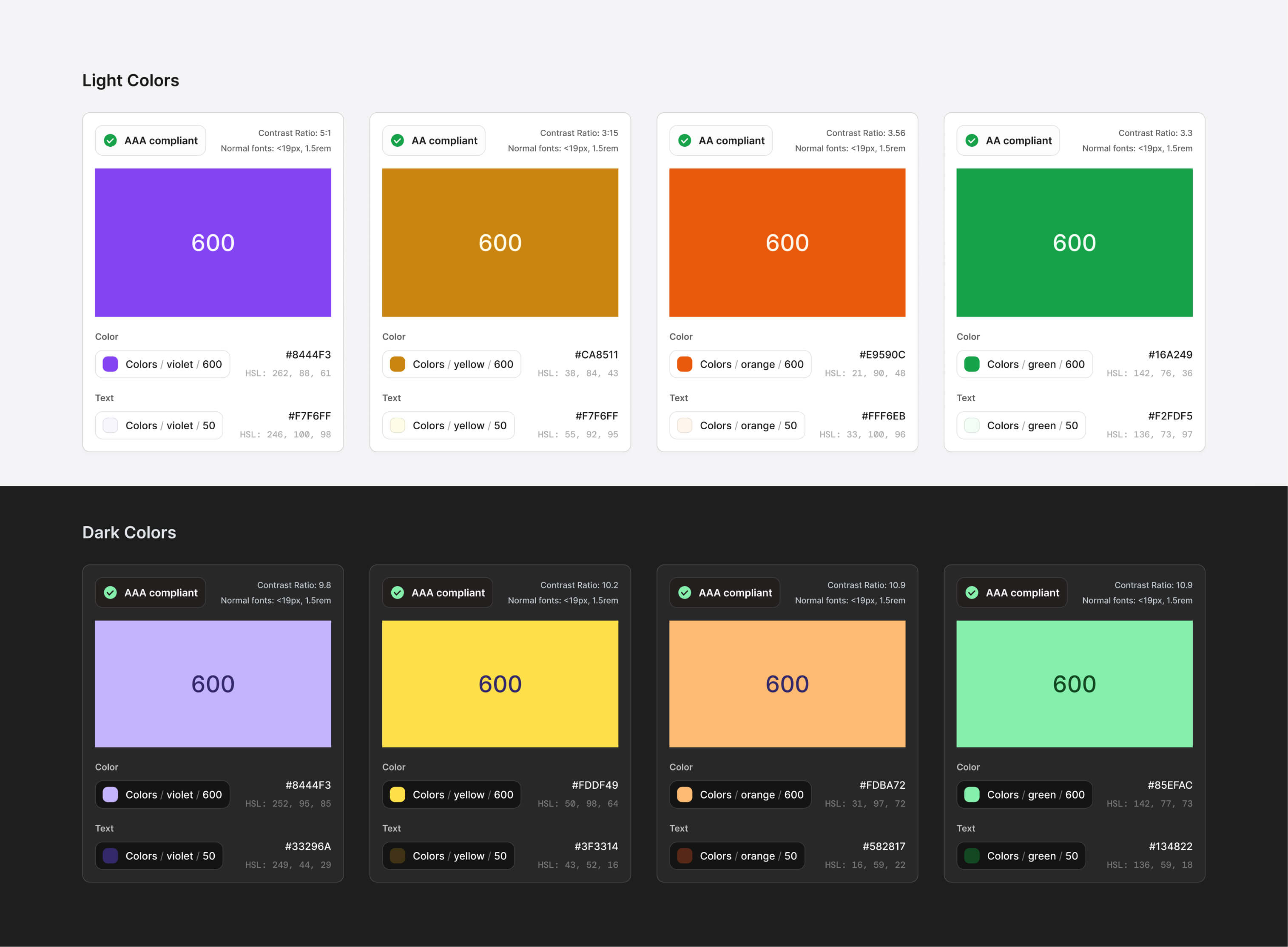
Frames X palette is focused on easy scaling and seamless customization. All Included colors utilize current web content accessibility guidelines (WCAG 2.4.1) with post-processing of the APCA model, which is an ideal combination for calculating perfect contrast balance for every available UI color.
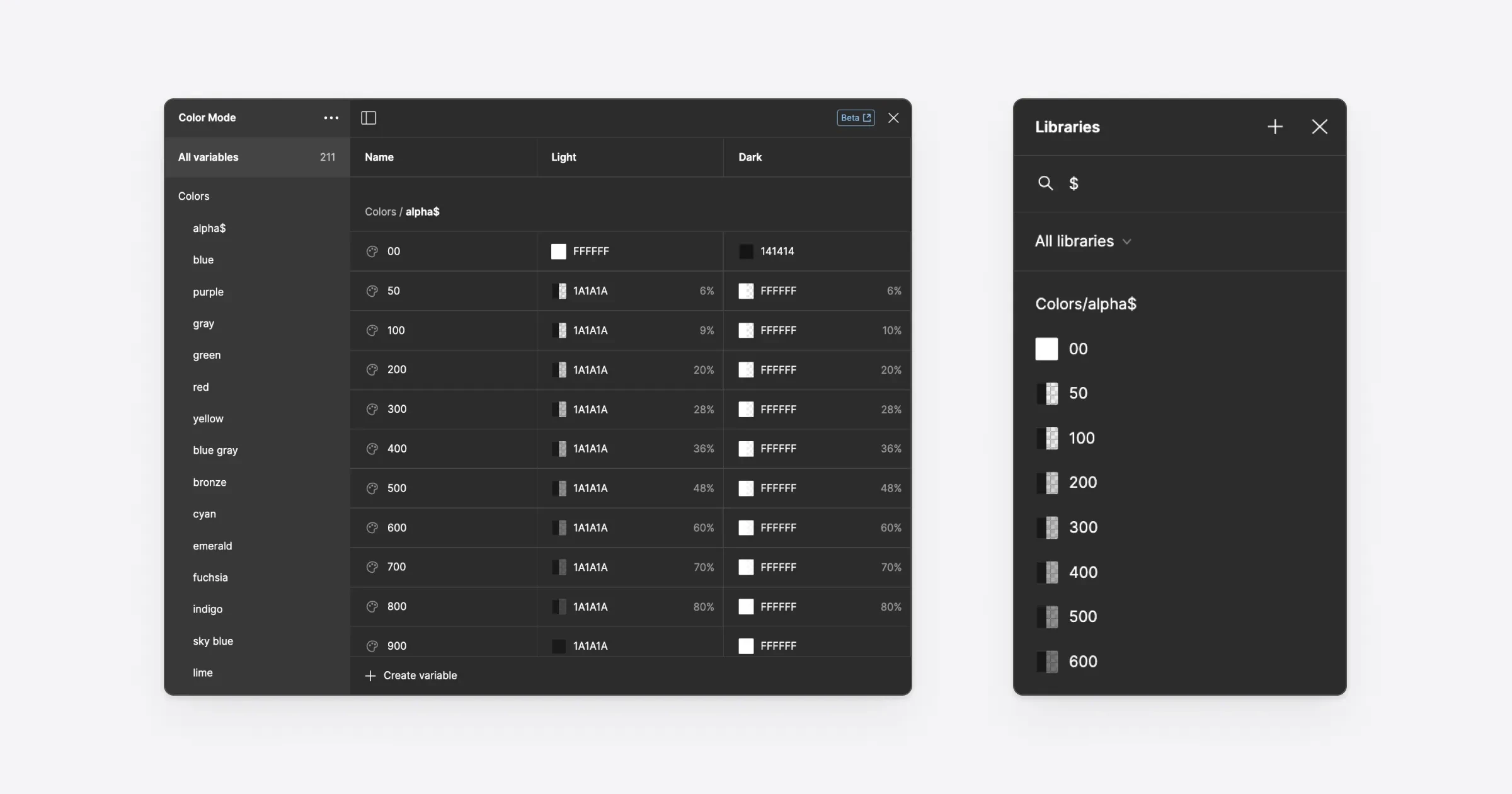
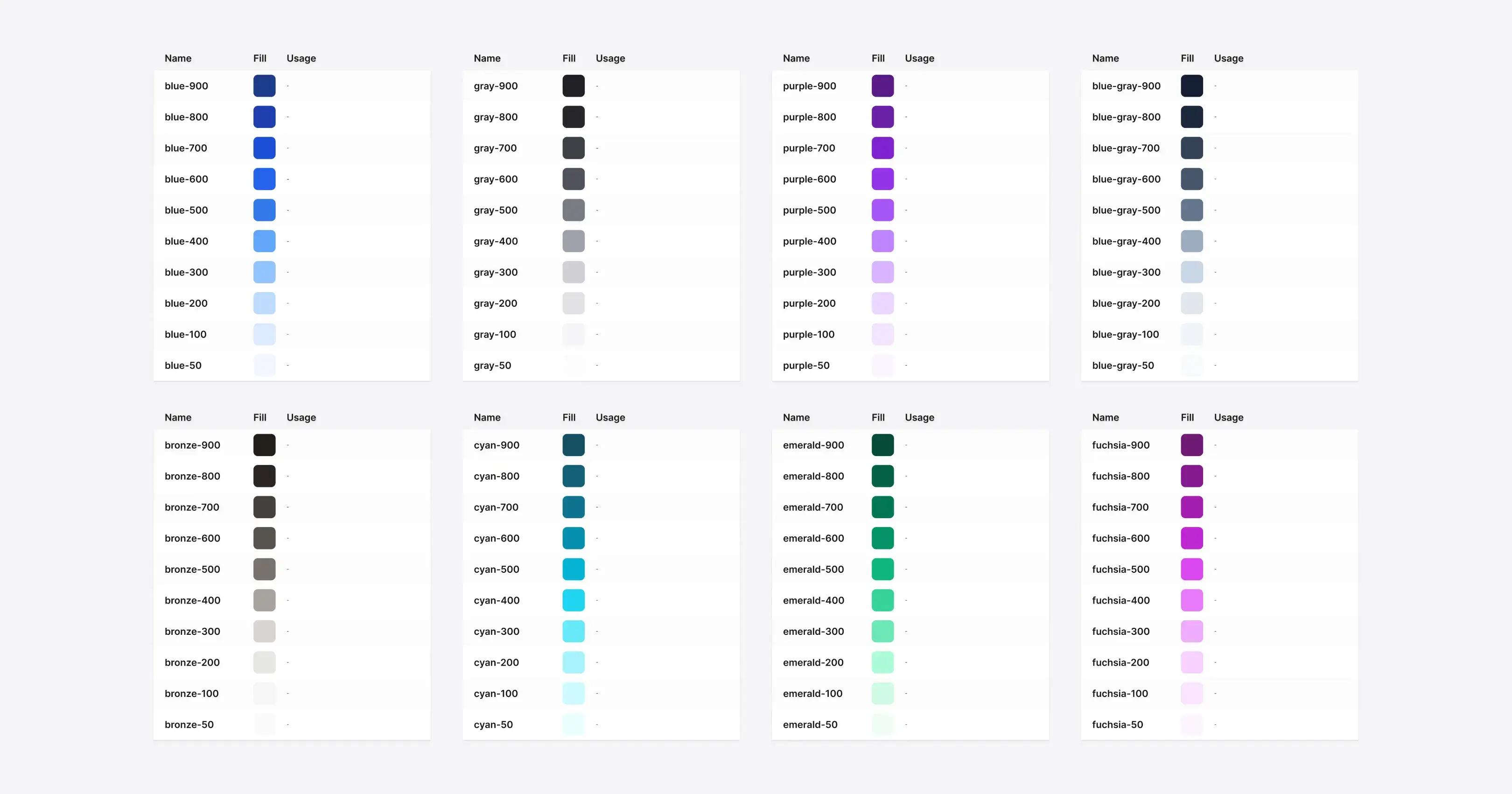
In Frames X, each color has a group that includes ten shades to display the full spectrum of UI-applicable colors powered by the Figma features such as Variables and Color Styles.
Frames X UI color pallete ensure consistent contrast within and between each group, with every color name corresponding to its saturation level (contrast ratio).
This way, Frames X's palette allows colors to reflect elevation and hierarchy through the interface and helps to achieve consistent results when customized based on predefined ratios.
Precise color contrast ratio
When utilizing the Frames X color palette, you can expect a similar or nearly equal contrast between color groups when using shades from the same saturation range. This is unique to our palette features and allows you to confidently and efficiently set your primary and brand colors that will scale as your project grows.
Tip: We recommend using a range of 500-600 for primary active elements and 50-100 for backgrounds and surfaces for optimal UI accessibility.
Optimized dark mode
Frames X's dark mode uses a less saturated color palette to maintain accessibility and increase eye comfort in a dim interface environment. The dark color palette communicates hierarchy using desaturated fill colors instead of only reversing the values from light colors as most design palettes do.
Tip: You can switch between color modes anytime and expect the same accessibility levels. To switch from one color mode to another, you can select any elements with color variables applied and use the control in the right sidebar on the Layer panel to switch modes.
Tailwind and Bootstrap compatible
Frames X palettes can help you transition your designs to Tailwind or Bootstrap. The color palette is fully compatible with Tailwind and Bootstrap naming conventions. It shares the same number of color steps, saturation levels, and naming conventions as the most popular frameworks.
Tips on working with UI colors
Frames X color pallete aims to help you solve the most common design system scenarios, such as: updating your colors globally, sorting, grouping, and naming your colors, as well as sharing your colors with your team.
Proper communication is the key in all of these scenarios. However, it's common to reshape, rename, and rearrange your colors throughout the project lifespan. So, the way you translate your decisions can become more crucial as your project grows.
To help you choose and communicate colors more effectively — our palette includes guidelines explaining "where" and "why" certain colors are used. This will visually demonstrate the reasoning behind the color choice.
Using colors from a team library
When starting a new project, you could add Frames X as your Team library and save yourself a massive amount of time adding colors or using third-party tools to generate them manually.
Using an external color palette will allow you to quickly populate your new project with a broad and thoughtful range of colors. Colors could become a separate library your team access without cracking your ongoing work, helping everyone be on the same page regarding the project/file they are working on.
Note that the team library feature will require a proffesional Figma plan.
Is it worth it? Absolutely. A separate color or "brand colors" library/file will help you better communicate your design decisions while staying consistent across prominent projects and organizations.
Tag colors to find them faster
Tagging color variables is a great practice to speed up your workflow in Figma. This practice could be applied not only when working with color variables but also with components and styles.
Tagging your colors will help you to quickly reveal the needed color or group of colors through Figma menus by typing a special symbol or an included "tag" name.
Note: Frames X, by default, uses a '$' tag to prioritize the most frequently used colors/styles used for primary purposes, such as text and active elements.
Working with the naming convention
Frames X uses literal or definitive color naming (like red, blue, etc.) and a numeric scale where 50 is lightest and 900 is darkest shade by default. While this is reasonably functional for most tasks, there are good reasons to use other naming conventions to communicate better on different projects and teams.
With literal color naming, it's easier to adapt the color palette either to a semantic or contextual approach by renaming colors from "color" to "Color-name" or "Color-primary' syntax.
Semantic naming convention uses names that describe the intent of the color ("Primary," "Secondary, "Danger," "Background," etc.). Semantic naming allows underlining the value of the color rather than using a combination of name and numeric scale, making it easy to explain the purpose of the color. Other examples of semantic naming include Brand, Accent, Warning, or Success tags, to name a possible few.
Contextual naming uses names for a more precise definition. Contextual naming illustrates a color for an exact component or layout, e.g.: ("color-primary-button," "color-default-icon-small," "color-error-modal," etc.). Contextual naming is most effective during the final stages of the design system development process, where no new components are added to the system.
This approach allows for a detailed and comprehensive understanding of the project, with clear context behind each style and color, making the adoption process easier.
Frames X's palette is easily adaptable to any circumstance, whether you choose to use a semantic or contextual approach.
Note: Starting with contextual naming can lead to an overwhelming number of definitions, which can mess up your design process. It's easy to get carried away with naming every color, and contextual naming can quickly become an exponential task. Therefore, it's best to only apply it when necessary, usually for smaller projects. (Based on our personal experience).
Understanding color models
Color modes are predefined sets of color values with numeric combinations used to accurately represent colors in digital or print design, such as RGB and Hex for digital screens and CMYK for printing.
As designers, we tend to feel comfortable working with the Hex colors because of how compact they are. However, Hex values are tough to read, and it's unlikely you would be able to guess the color of an element by reading them, except if you are an expert designer.
HSL is another color model that stands for Hue, Saturation, and Lightness. It is considered to be more intuitive than RGB in understanding colors from a non-technical perspective. In HSL, the Hue determines the color displayed on a 360-degree color wheel. One of the significant advantages of the HSL color wheel over RGB is that complementary (same saturation) colors are placed opposite each other.
For instance, by adjusting the lightness numeric values, we can obtain darker or lighter variants of the color, or by modifying the saturation value, we can achieve a completely different color with the same amount of saturation. This approach is a more convenient way to interpret how our eyes perceive colors compared to RGB or Hex models.
The advantage of HSL over RGB is that it is easier to create pallets of matching colors by keeping their hue values at the same range and adjusting only the lightness and saturation values.
Tip: it may be a good idea to explain how to copy a CSS-friendly color code to your fellow developer friend. In Figma, you can access the color code via the inspect mode (Developer Mode tab). You can select the RGB color model from the Colors section dropdown when you select any element on the canvas.
Thank you for the read!
If you enjoyed this, be sure to check out Frames X, our meticulously crafted UI kit and design system for Figma. Elevate your creative flow and unlock more innovative design solutions.
Intro to Frames X's UI color system
Frames X palette is focused on easy scaling and seamless customization. All Included colors utilize current web content accessibility guidelines (WCAG 2.4.1) with post-processing of the APCA model, which is an ideal combination for calculating perfect contrast balance for every available UI color.
In Frames X, each color has a group that includes ten shades to display the full spectrum of UI-applicable colors powered by the Figma features such as Variables and Color Styles.
Frames X UI color pallete ensure consistent contrast within and between each group, with every color name corresponding to its saturation level (contrast ratio).
This way, Frames X's palette allows colors to reflect elevation and hierarchy through the interface and helps to achieve consistent results when customized based on predefined ratios.
Precise color contrast ratio
When utilizing the Frames X color palette, you can expect a similar or nearly equal contrast between color groups when using shades from the same saturation range. This is unique to our palette features and allows you to confidently and efficiently set your primary and brand colors that will scale as your project grows.
Tip: We recommend using a range of 500-600 for primary active elements and 50-100 for backgrounds and surfaces for optimal UI accessibility.
Optimized dark mode
Frames X's dark mode uses a less saturated color palette to maintain accessibility and increase eye comfort in a dim interface environment. The dark color palette communicates hierarchy using desaturated fill colors instead of only reversing the values from light colors as most design palettes do.
Tip: You can switch between color modes anytime and expect the same accessibility levels. To switch from one color mode to another, you can select any elements with color variables applied and use the control in the right sidebar on the Layer panel to switch modes.
Tailwind and Bootstrap compatible
Frames X palettes can help you transition your designs to Tailwind or Bootstrap. The color palette is fully compatible with Tailwind and Bootstrap naming conventions. It shares the same number of color steps, saturation levels, and naming conventions as the most popular frameworks.
Tips on working with UI colors
Frames X color pallete aims to help you solve the most common design system scenarios, such as: updating your colors globally, sorting, grouping, and naming your colors, as well as sharing your colors with your team.
Proper communication is the key in all of these scenarios. However, it's common to reshape, rename, and rearrange your colors throughout the project lifespan. So, the way you translate your decisions can become more crucial as your project grows.
To help you choose and communicate colors more effectively — our palette includes guidelines explaining "where" and "why" certain colors are used. This will visually demonstrate the reasoning behind the color choice.
Using colors from a team library
When starting a new project, you could add Frames X as your Team library and save yourself a massive amount of time adding colors or using third-party tools to generate them manually.
Using an external color palette will allow you to quickly populate your new project with a broad and thoughtful range of colors. Colors could become a separate library your team access without cracking your ongoing work, helping everyone be on the same page regarding the project/file they are working on.
Note that the team library feature will require a proffesional Figma plan.
Is it worth it? Absolutely. A separate color or "brand colors" library/file will help you better communicate your design decisions while staying consistent across prominent projects and organizations.
Tag colors to find them faster
Tagging color variables is a great practice to speed up your workflow in Figma. This practice could be applied not only when working with color variables but also with components and styles.
Tagging your colors will help you to quickly reveal the needed color or group of colors through Figma menus by typing a special symbol or an included "tag" name.
Note: Frames X, by default, uses a '$' tag to prioritize the most frequently used colors/styles used for primary purposes, such as text and active elements.
Working with the naming convention
Frames X uses literal or definitive color naming (like red, blue, etc.) and a numeric scale where 50 is lightest and 900 is darkest shade by default. While this is reasonably functional for most tasks, there are good reasons to use other naming conventions to communicate better on different projects and teams.
With literal color naming, it's easier to adapt the color palette either to a semantic or contextual approach by renaming colors from "color" to "Color-name" or "Color-primary' syntax.
Semantic naming convention uses names that describe the intent of the color ("Primary," "Secondary, "Danger," "Background," etc.). Semantic naming allows underlining the value of the color rather than using a combination of name and numeric scale, making it easy to explain the purpose of the color. Other examples of semantic naming include Brand, Accent, Warning, or Success tags, to name a possible few.
Contextual naming uses names for a more precise definition. Contextual naming illustrates a color for an exact component or layout, e.g.: ("color-primary-button," "color-default-icon-small," "color-error-modal," etc.). Contextual naming is most effective during the final stages of the design system development process, where no new components are added to the system.
This approach allows for a detailed and comprehensive understanding of the project, with clear context behind each style and color, making the adoption process easier.
Frames X's palette is easily adaptable to any circumstance, whether you choose to use a semantic or contextual approach.
Note: Starting with contextual naming can lead to an overwhelming number of definitions, which can mess up your design process. It's easy to get carried away with naming every color, and contextual naming can quickly become an exponential task. Therefore, it's best to only apply it when necessary, usually for smaller projects. (Based on our personal experience).
Understanding color models
Color modes are predefined sets of color values with numeric combinations used to accurately represent colors in digital or print design, such as RGB and Hex for digital screens and CMYK for printing.
As designers, we tend to feel comfortable working with the Hex colors because of how compact they are. However, Hex values are tough to read, and it's unlikely you would be able to guess the color of an element by reading them, except if you are an expert designer.
HSL is another color model that stands for Hue, Saturation, and Lightness. It is considered to be more intuitive than RGB in understanding colors from a non-technical perspective. In HSL, the Hue determines the color displayed on a 360-degree color wheel. One of the significant advantages of the HSL color wheel over RGB is that complementary (same saturation) colors are placed opposite each other.
For instance, by adjusting the lightness numeric values, we can obtain darker or lighter variants of the color, or by modifying the saturation value, we can achieve a completely different color with the same amount of saturation. This approach is a more convenient way to interpret how our eyes perceive colors compared to RGB or Hex models.
The advantage of HSL over RGB is that it is easier to create pallets of matching colors by keeping their hue values at the same range and adjusting only the lightness and saturation values.
Tip: it may be a good idea to explain how to copy a CSS-friendly color code to your fellow developer friend. In Figma, you can access the color code via the inspect mode (Developer Mode tab). You can select the RGB color model from the Colors section dropdown when you select any element on the canvas.
Thank you for the read!
If you enjoyed this, be sure to check out Frames X, our meticulously crafted UI kit and design system for Figma. Elevate your creative flow and unlock more innovative design solutions.
⟡
⟡
⟡
Download Frames X Color Palette for Free — Get started with a perfectly organized and accessible set of color variables as your brand foundation.