May 15, 2024
Figma tips & tricks to work efficiently
Best practices to design smarter and faster with Figma

Learning how to use Figma can be challenging, but it's definitely rewarding. Especially if you are a professional freelancer, developer, or part of a design team, mastering the best practices of the tool you're working with can help you achieve results much faster.
On this page, we've collected our favorite ever-lasting tips to help both beginners and advanced users get more from daily working with Figma. This is an ever-growing list, so bookmark ☆ it and revisit it occasionally for new tips.
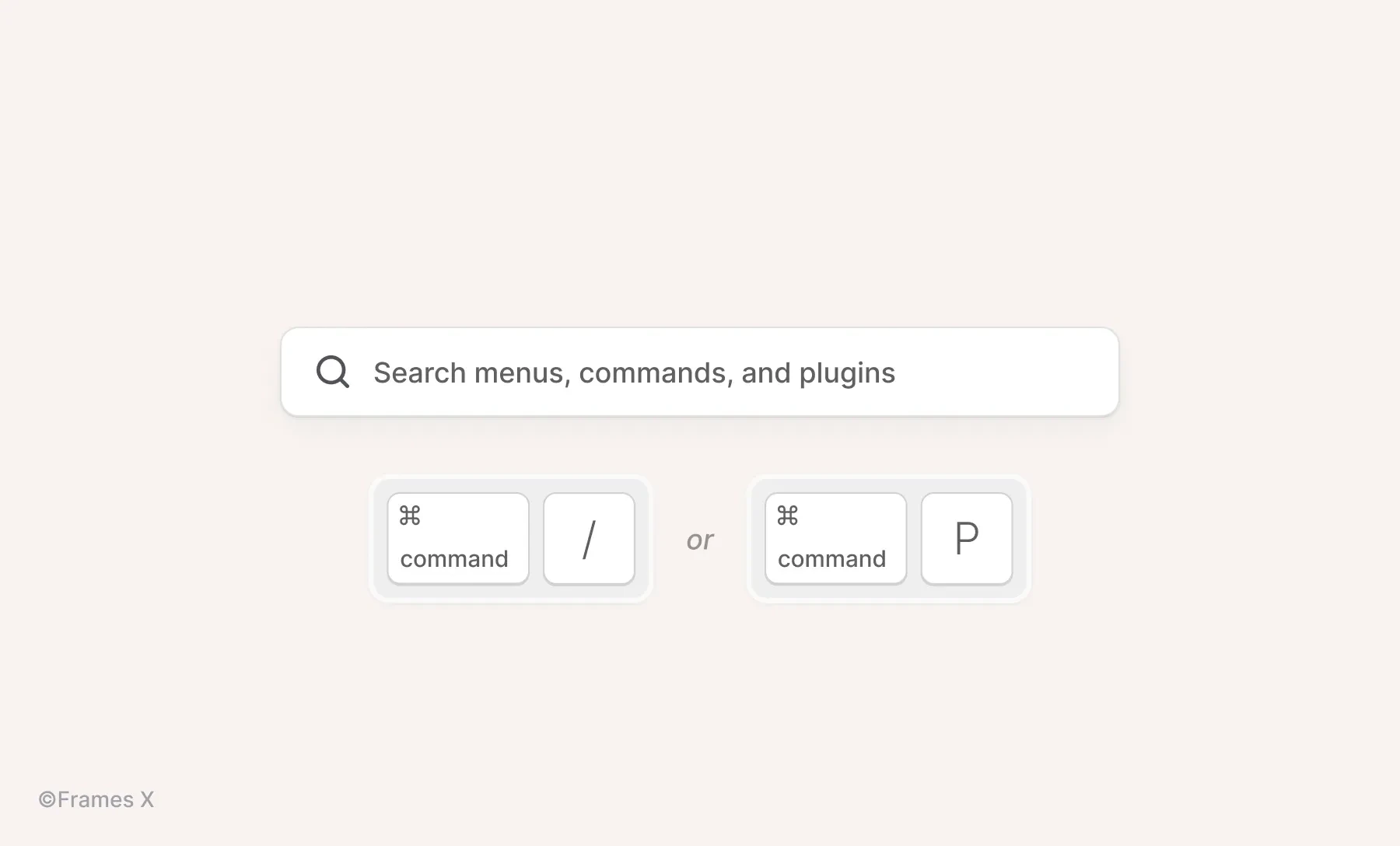
Use the quick actions command menu
With the help of quick actions, you can access all available commands, plugins, and recently performed actions from the comfort of a single floating menu. To open it, use the following shortcut:
for Mac: ⌘ CMD + / or ⌘ CMD + P;
for Windows: Control + / or Control + P;
Navigate the results with ↑ or ↓ arrows on your keyboard;
Smash Enter / Return to execute the needed command.
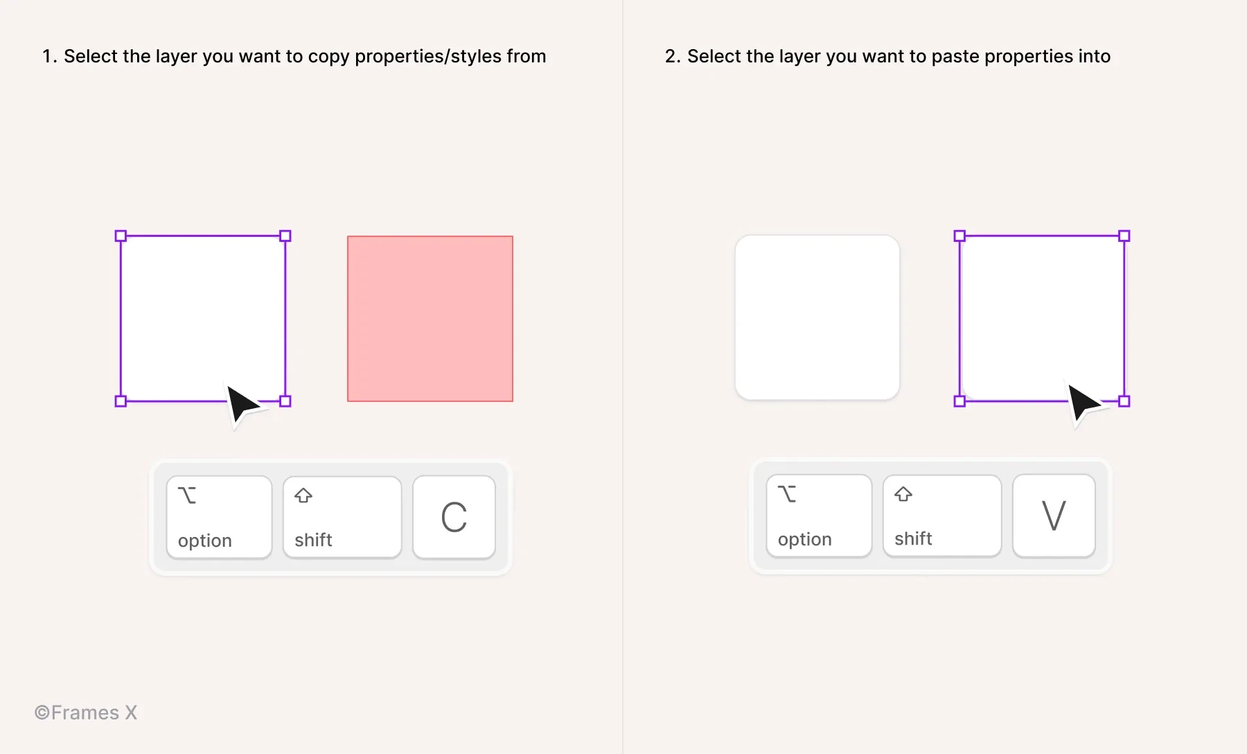
Copy/paste properties with shortcuts
Use Option ⌥ + ⇧ Shift + C to copy layer properties from one object and then Option ⌥ + ⇧ Shift + V to paste them into another.
Optimize your nudge distance
Set a custom increment for your small and large nudges to move/align elements more quickly, with or without using SHIFT. Customize the nudge based on your daily tasks and save time on those small adjustments.
You can change the default nudge amount by using the Quick Actions CMD ⌘ + / and typing 'nudge';
You can also change it from the main menu in Figma, navigate to Preferences - Nudge amount.
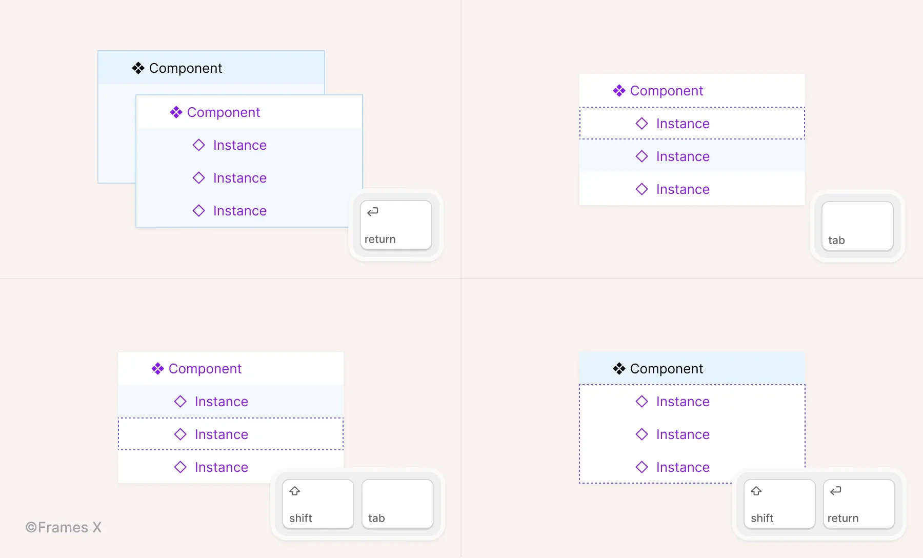
Use shortcuts to navigate the layer structure
When trying to dig into a component or group of layers, we usually tend to spend time aiming for the right pixels to click.
Instead, 99% of the time, it's faster to use shortcuts to navigate the component or any group of layers on the canvas with a mouse-free approach. To do so, use the following shortcuts:
Enter to drill down through the Layers panel elements quickly;
Tab key to jump-navigate the list of layers from up to down;
⇧ Shift + Tab to return to a previous layer;
⇧ Shift + Enter to return to an upper level.
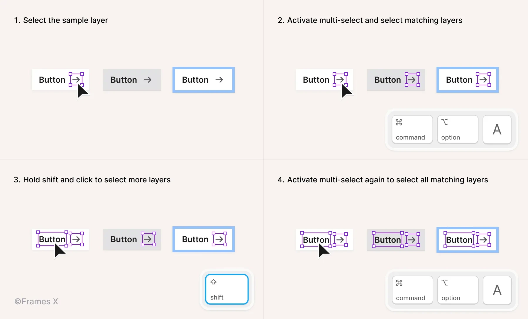
Use multi-select and multi-edit elements
Multi-select is a feature that allows you to align, make changes, and edit multiple identical objects at once.
When the Multi-select mode is activated, it searches for matching objects on the same levels of your design hierarchy that is selected, e.g., layer structure. The mode works for frames and variants, so you can take advantage of it when assembling and editing designs.
The best way to explain it is to try it.
Use the following shortcut: ⌘ CMD + ⌥ Option + A to activate the mode and select all matching objects.
When activated, you can use ⇧ Shift + Click to choose more layers that match the currently selected ones.
Note: When activated for multiple text layers, you can press Enter to edit multiple text contents.
You can also use Multi-edit mode to manage multiple component sets. Press Q when a component is selected to edit matching variants in the set.
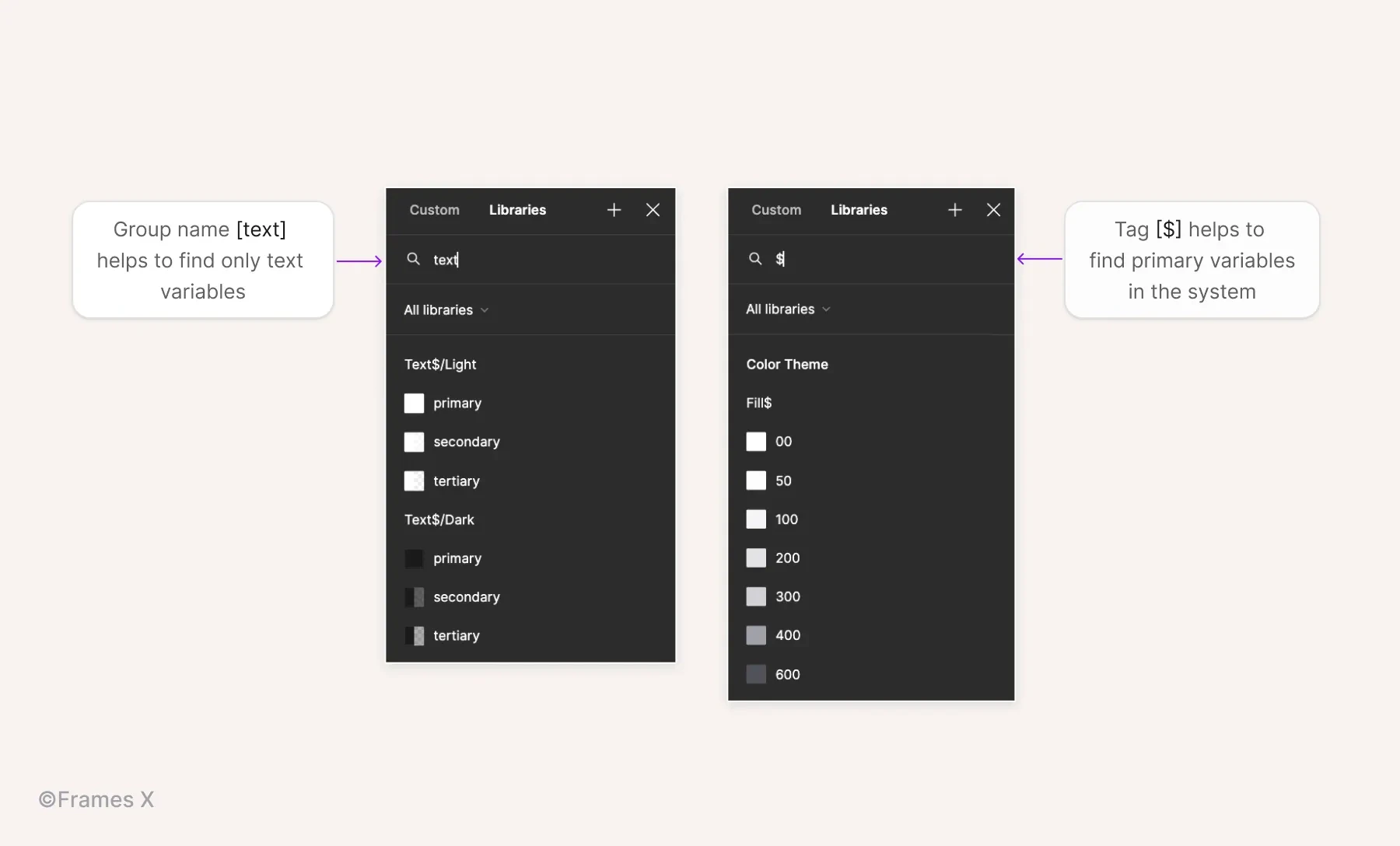
Tag styles to find them faster
One of the most common things designers do when working in Figma is searching for styles and variables to apply to the selection.
Eventually, certain styles or variables become more frequently searched rather than others as the project matures.
To speed up this monotonous process and find needed styles faster, you can add a special symbol or use group names to filter styles and variables in Figma menus faster.
For example, the Frames X design system uses a '$ tag' (a String) to mark all primary and base elements, making them easier to access and use across files/projects.
Note: Use group names to find enclosing styles and variables. For example typing 'text' could reveal all available styles/variables applicable to text elements.
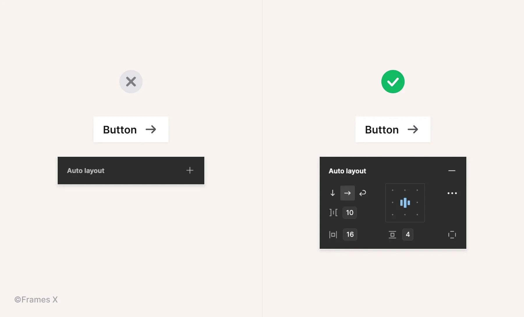
Use auto layout for dynamic elements
Adding auto layout to a group or a frame will override its default spacing values and make elements inside follow a specific direction and distribution order. The content will become sensitive to the Auto layout settings from the right sidebar.
To apply an auto layout, select a group or frame and use the keyboard shortcut ⇧ Shift + A to apply it. Or click + next to the Auto Layout label in the right sidebar.
Adjust auto layout flow for dynamic contents
When applied to a container, Auto layout can change the position and direction of nested elements.
Use Vertical direction to position elements on the Y-axis;
Use Horizontal direction to position elements on the X-axis;
Use Wrap to position elements in Z-order when elements move to the next line on contents resize.
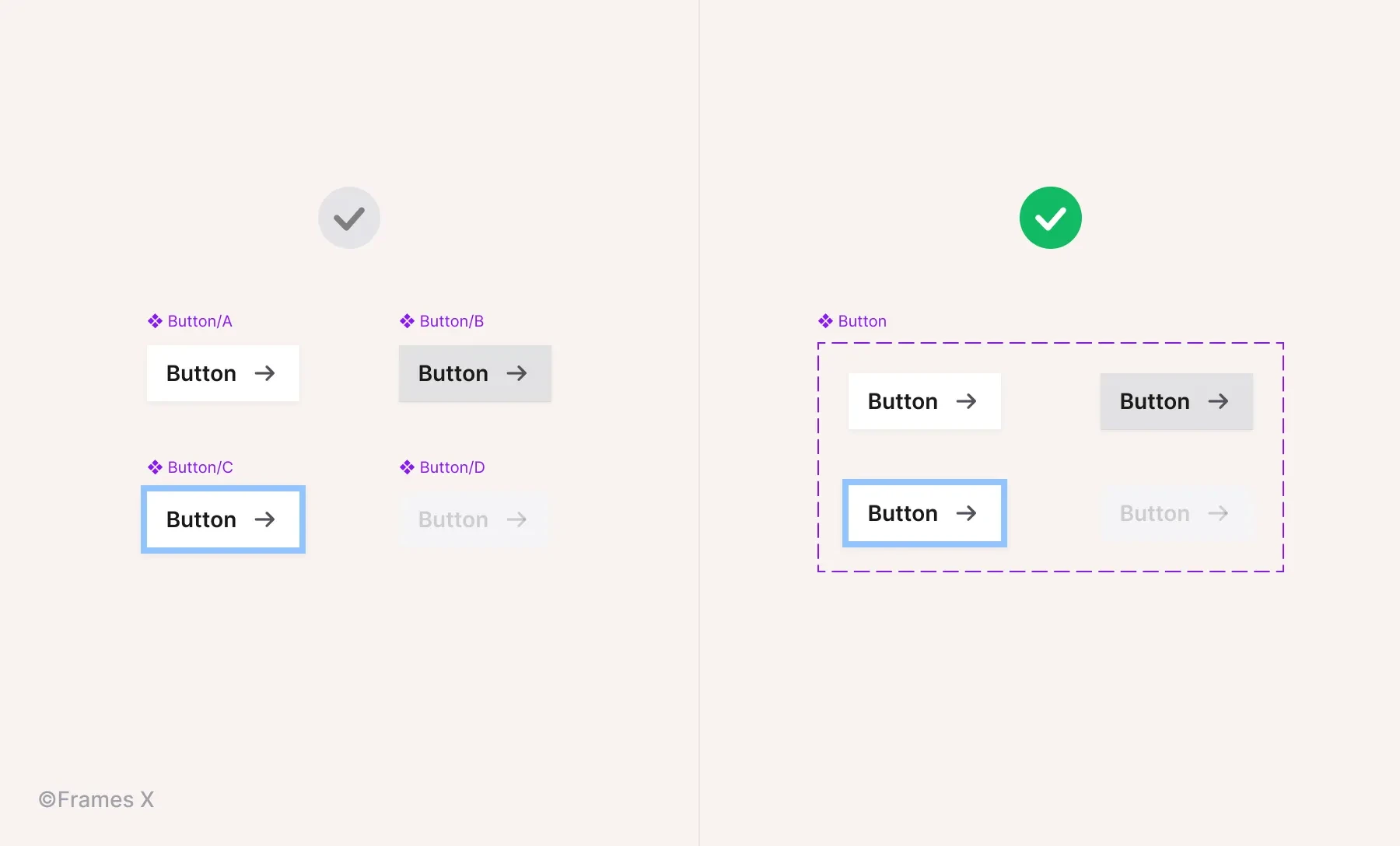
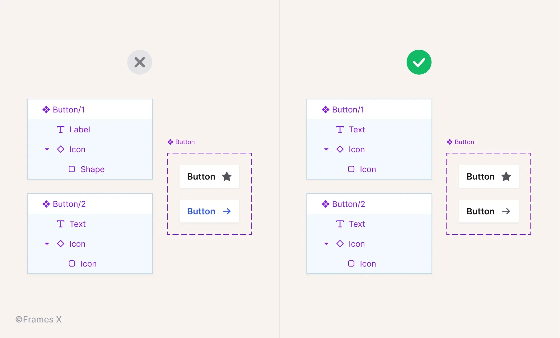
Use variants to have fewer components
Variants in Figma help to outline multiple components to a single codependent structure.
Variants apply the Slash naming method to organize selected components and partition them into different subcategories or 'branches/types.'
Applying variants is recommended when a component switches between different states or has multiple variations, such as size, shape, or color.
Elements like buttons, inputs, and toggles are all perfectly fit for variants.
With variants, you can simplify the design system structure, reducing the number of components you need to maintain in the long run and contributing to the adoption of the design system.
Note: Not every component set should have variants. It would be best if you decided whether variants should be involved or not based on how somebody will operate the component you made. Here is a nicely written article on that particular topic.
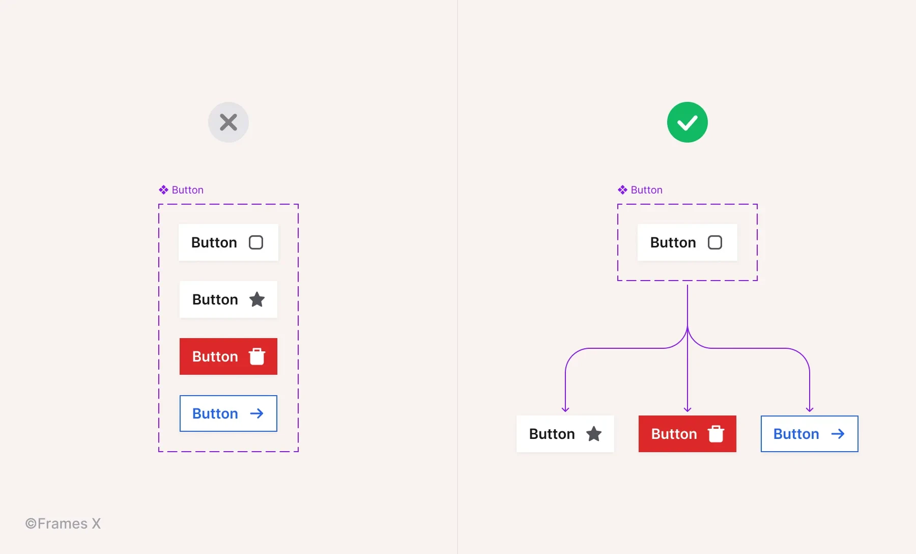
Streamline changes with nested components
Nested components are structural elements that can help streamline changes to other components.
A nested component (A) is always within a component (B), so all B component variants stay in sync by utilizing component A instances, saving you time from manually updating each instance of B.
A nested component could also have the status of a Base component. This could be any element (icon, symbol, shape.), so instead of making variants for each component, you can use the base instances to make changes directly to the main component instances.
The most common example of a Base component is an icon component that is nested inside other components' variants.
For example, when working with multiple button variants, it could be beneficial to use a single Base Icon component that can be customized to fit any button type/variant.
Preserve component overrides
When making changes or 'applying overrides' to components, you may want to save changes applied to them before, such as preserving an icon color, nested element size, or specific variant.
Consider these 2 rules to preserve changes between components and variants:
To preserve changes between component layers, the structure and names of all layers inside should be identical;
To preserve variant properties, the names and hierarchy (properties and layer structure) must also match to preserve changes between similar or identical components.
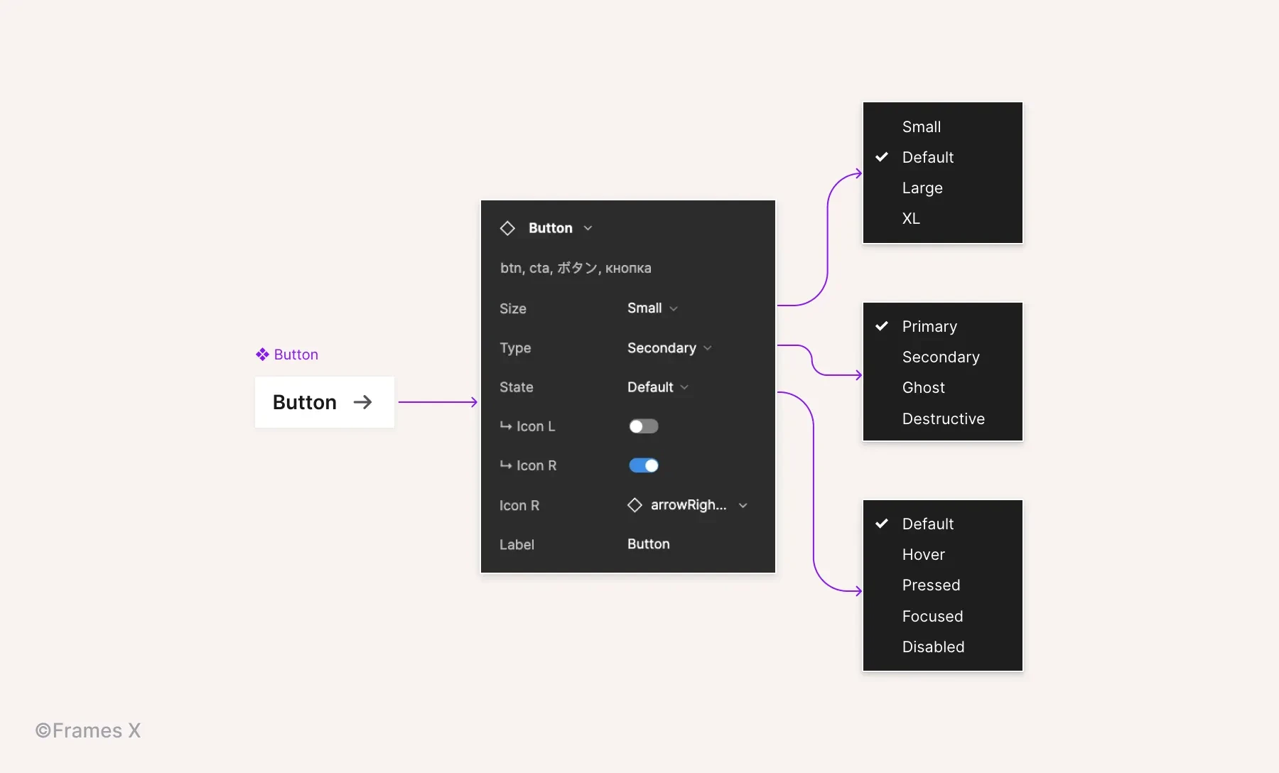
Use component properties
Component properties are unique options assigned to an individual set of shared components.
Properties eliminate the need to create additional variants for every minor difference in a component set. Instead of redundant variants with minor differences, such as an extra icon, text, or specific detail, use Properties.
By identifying and assigning common properties to components, you can achieve better consistency in your component sets while managing fewer variants without sacrificing functionality.
To create a Property, select a nested instance or layer inside a component;
Click on The property icon '⎆' to apply the relevant layer property.
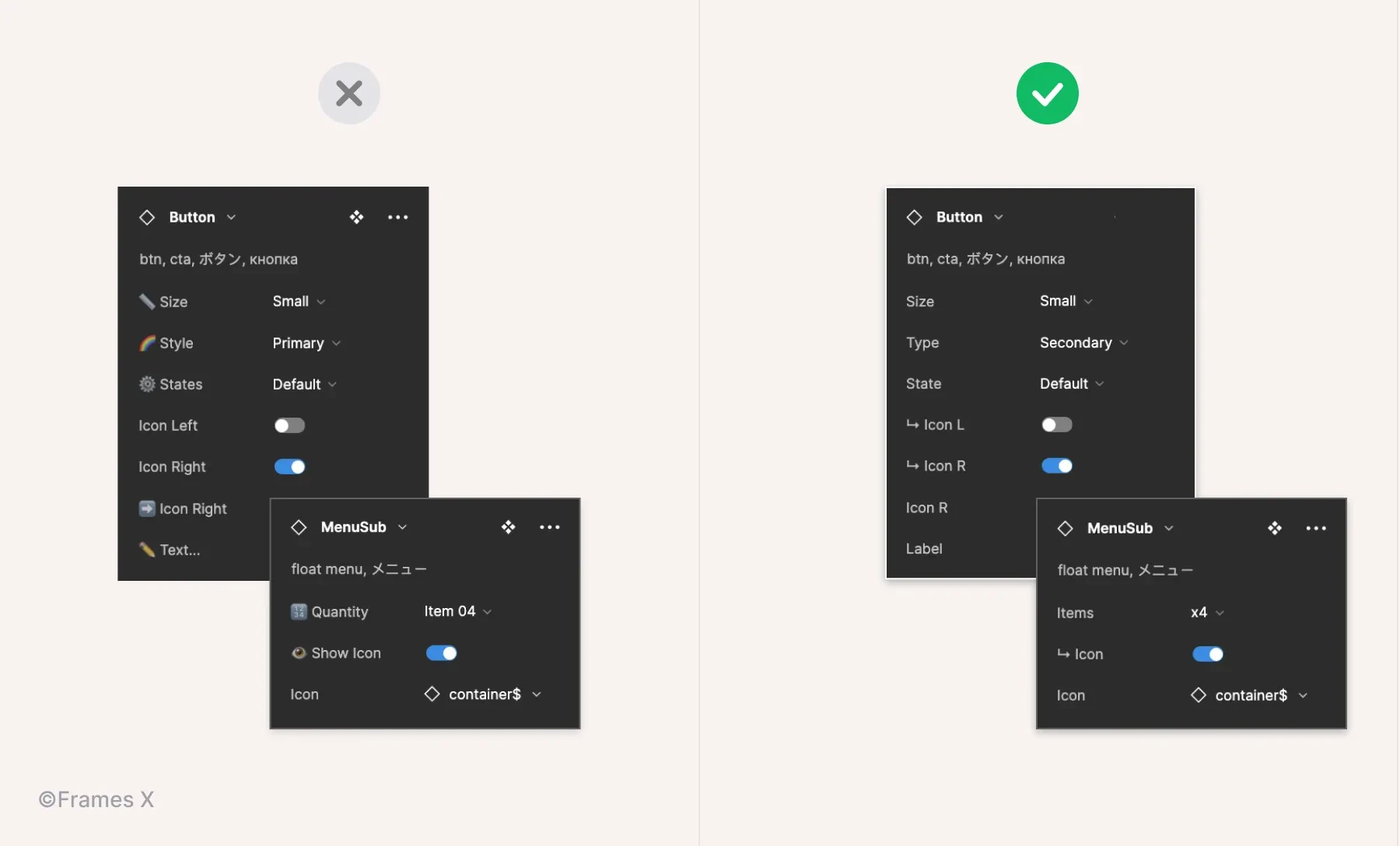
Use a consistent properties naming convention
Clear and consistent naming helps your project be more easily adopted and ensures the design-to-development process. It also helps preserve changes between variants, so don't overlook this important step for your Figma project.
Consider consulting with a developer for their input on the best way to name these dynamic options. Aligning your properties with your chosen dev stack will make things easier for your project lifespan.
Besides doing that, here are a few tips to help you set the naming:
Use the same names to describe the same properties/values across all of your components in your project;
Use the same naming convention as per the dev stack of your project. For example, Frames X uses default CSS names, as Default, Hover, Active, and Disabled for elements states;
Add a special symbol to properties that can reveal other properties. This will help identify more complex use cases making workflow with your designs more predictable;
For standard boolean properties such as Show/Hide icons or labels, use a symbol or short word (L, R, Top, Bot ) to indicate compactly which side or direction of the component an element will appear on;
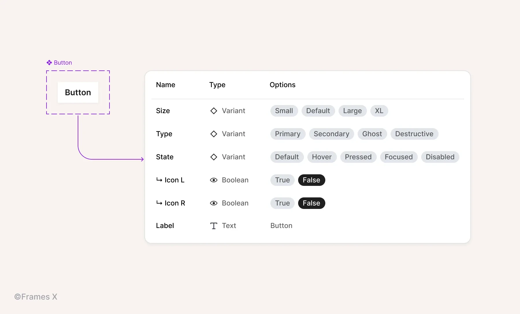
Limit the amount of properties. Too many properties can make the component difficult to operate for the right purpose. If the component becomes overengenired with properties/states, consider identifying and creating variants to break down such components;
You can encounter numerous component to have nested items inside. Such as could be a menu or dropdown list. Use a consistent way to indicate nested items available in a component. Use a numeric scale. e,g. x1, x2, x3 to indicate the number of items/elements per nested instance;
Avoid using emojis for real projects. Their interpretation can often be subjective and unclear, and they can also make your designs harder to maintain.
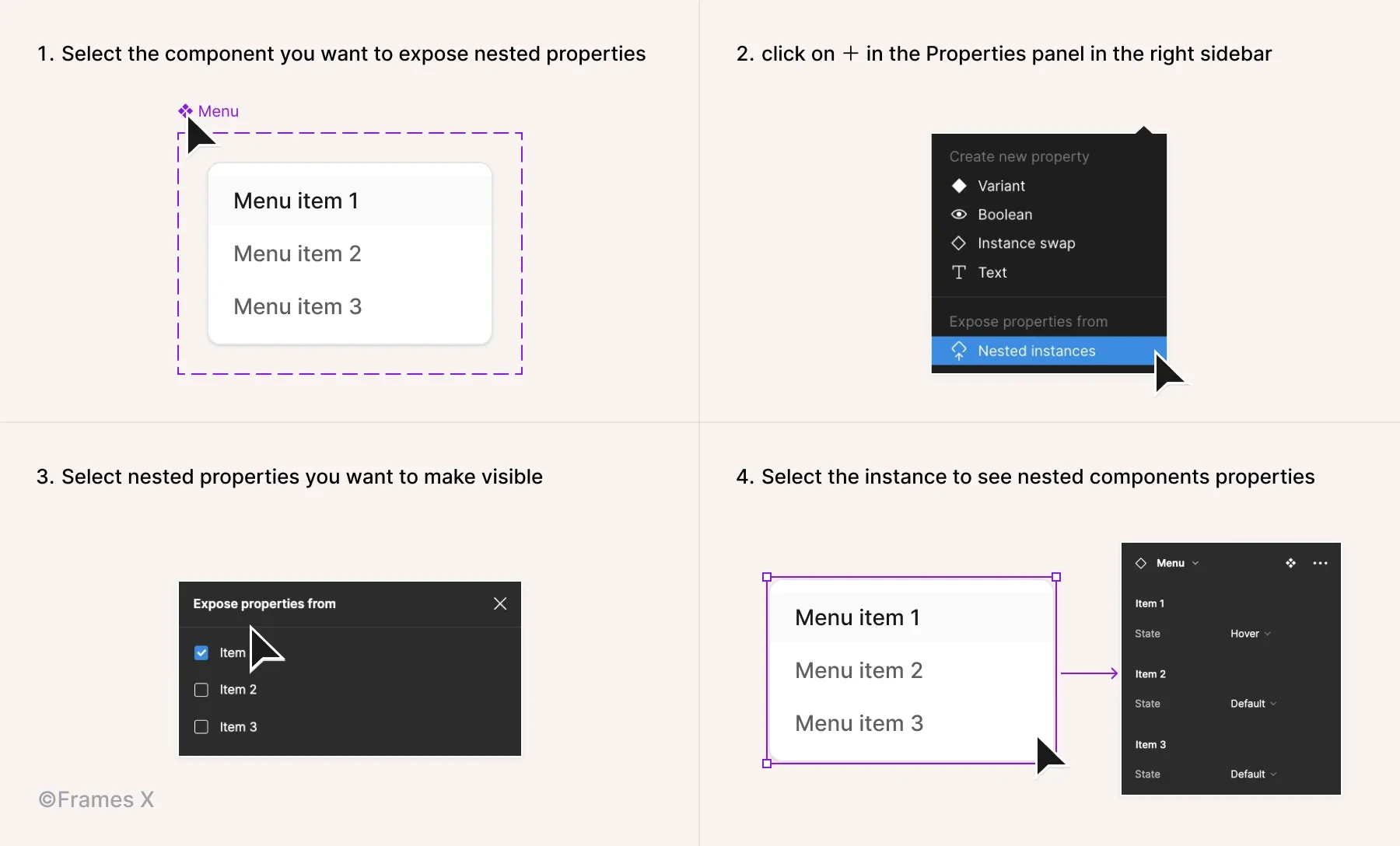
Expose nested instances
Exposing nested instances is a helpful practice that gives you more control over your component sets. With exposing, you can access any nested instances included from the main (top-level) component.
To expose nested instances, select a component or variant set, click on + in the Properties panel in the right sidebar, and choose the Nested instances from the list.
Note: The option to expose nested instances is only available if the main component already has nested instances in it.
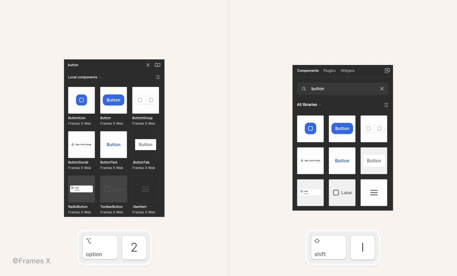
Use the quick insert menu
Insert components with your keyboard. Use the quick insert menu to search, drag and drop available components to your canvas.
Use ⇧ Shift + I to open the quick insert menu;
Use ⌥ Option + 2 to switch to the Assets panel.
Grab your teammates' attention
You can send a message from your cursor to quickly grab people's attention when pitching your ideas and decisions in Figma.
To enter the chat mod, deselect everything on the canvas and press '/' on the keyboard;
Press Enter/Return to clear the chat and type a new message.

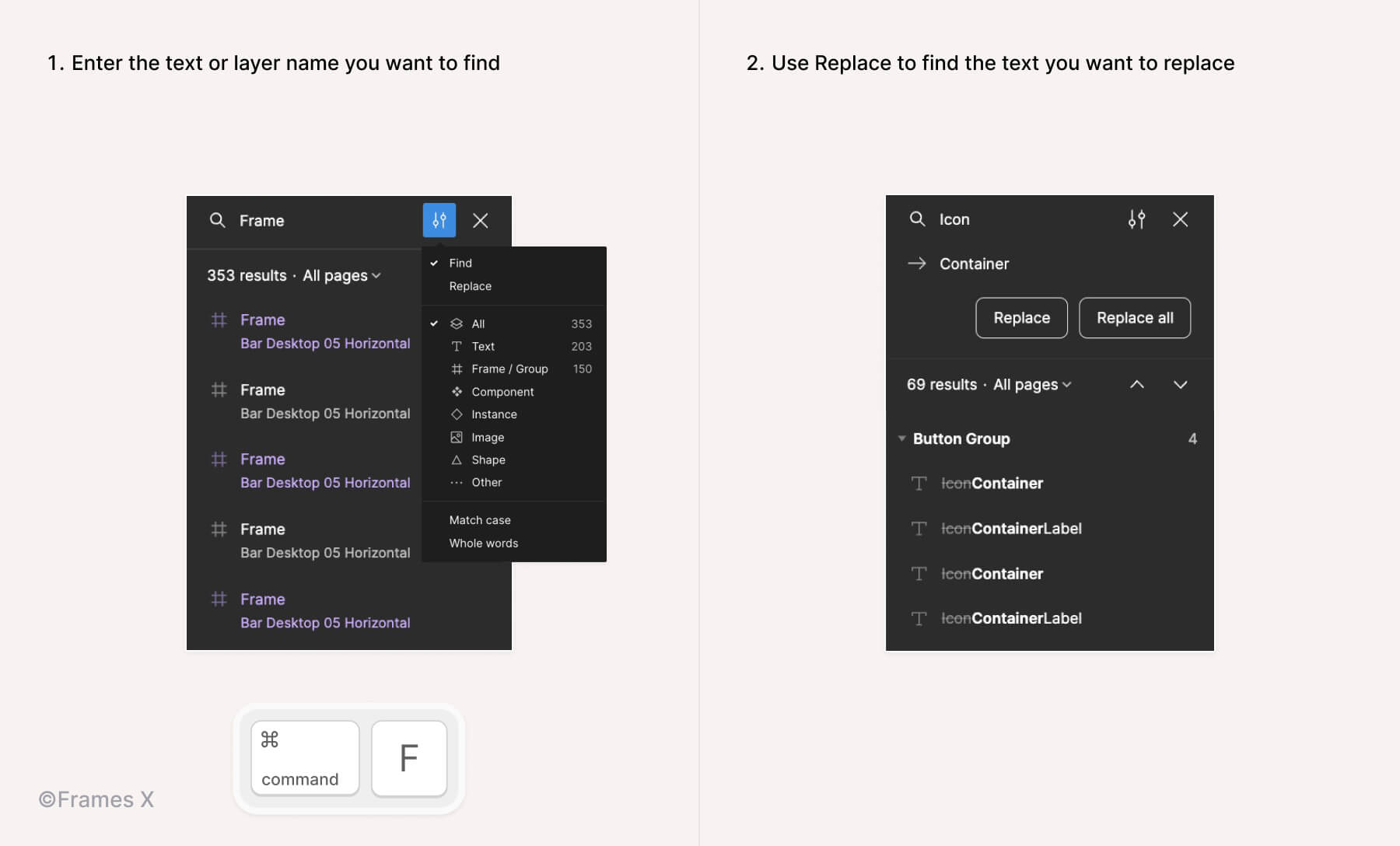
Quickly find and replace text in Figma files
If you've lost a particular layer or want to quickly replace text layers.
Use the shortcuts CMD ⌘ + F on Mac and CTRL + F on Windows to trigger the search box UI and search your file for any available type of object.
You can further use shortcuts: CMD ⌘ + ⇧ Shift + D to see the previous result; And CMD ⌘ + ⇧ Shift + F to see the following result in the search list;
You can use the Replace command to locate any object names and replace them with others across pages.
Note: Under the Replace option, only text layers are displayed. If you search for an item that cannot be replaced, such as a variable or style, no results will be displayed.
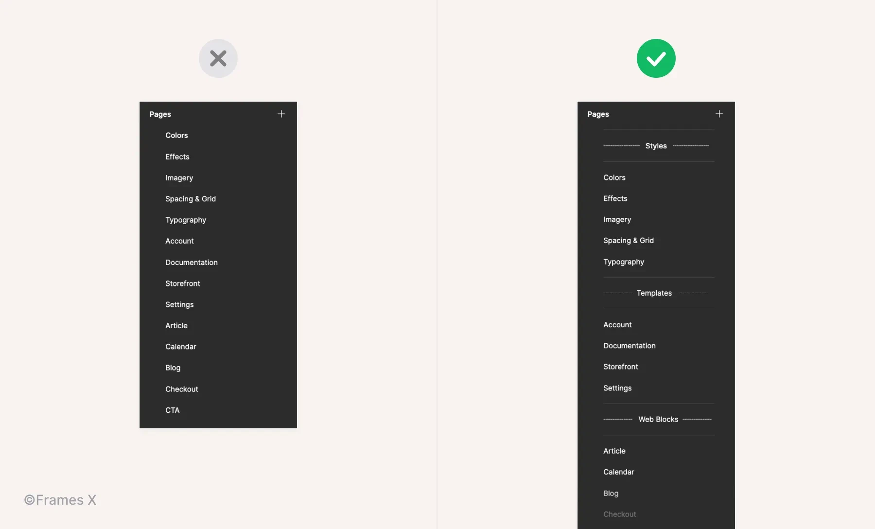
Use dividers to arrange pages in the file
As the project grows, so does the file, with many pages becoming harder to track.
Divide pages into sections or categories with dividers to speed up the process of navigating to the right page.
To add a divider, click on the + icon in the left panel. Or create a new page and type '---' as the page name.
Manage files' memory usage
When a Figma file becomes bloated and slow, it can be a real pain for a project. There are several hacks to apply to solve this issue.
When using components from different sources in one file, they can sometimes 'Lag' and display a wrong layout. To fix this, use the 'Regenerate all instances (slow)' command from the Quick Action menu.
Clear unused imported or deleted components. Sometimes, the components that we have been using in our files can continue to consume memory after the deletion. To solve this and remove these 'ghost" components and layers completly, use the 'Compute publish status of soft deleted components' command from the Quick Action menu.
To clear the Figma cache and refresh the memory usage of the opened tabs, Click Help in the top menu bar. Then go to Troubleshooting > Clear cache and restart.
Learn more basic tips from the Figma' officials guide.
Use a ready-made UI kit to speed up your workflow
The best way to speed up your design process in Figma — is to use a UI library or a design system kit that has everything pre-built in.
A good UI kit will help you find solutions to your design problems much faster and simplify your team's life without undergoing a long process of designing everything from scratch. Sounds good, right?
But, a good UI kit is hard to find, with many solutions built solely for decorative or inspirational purposes.
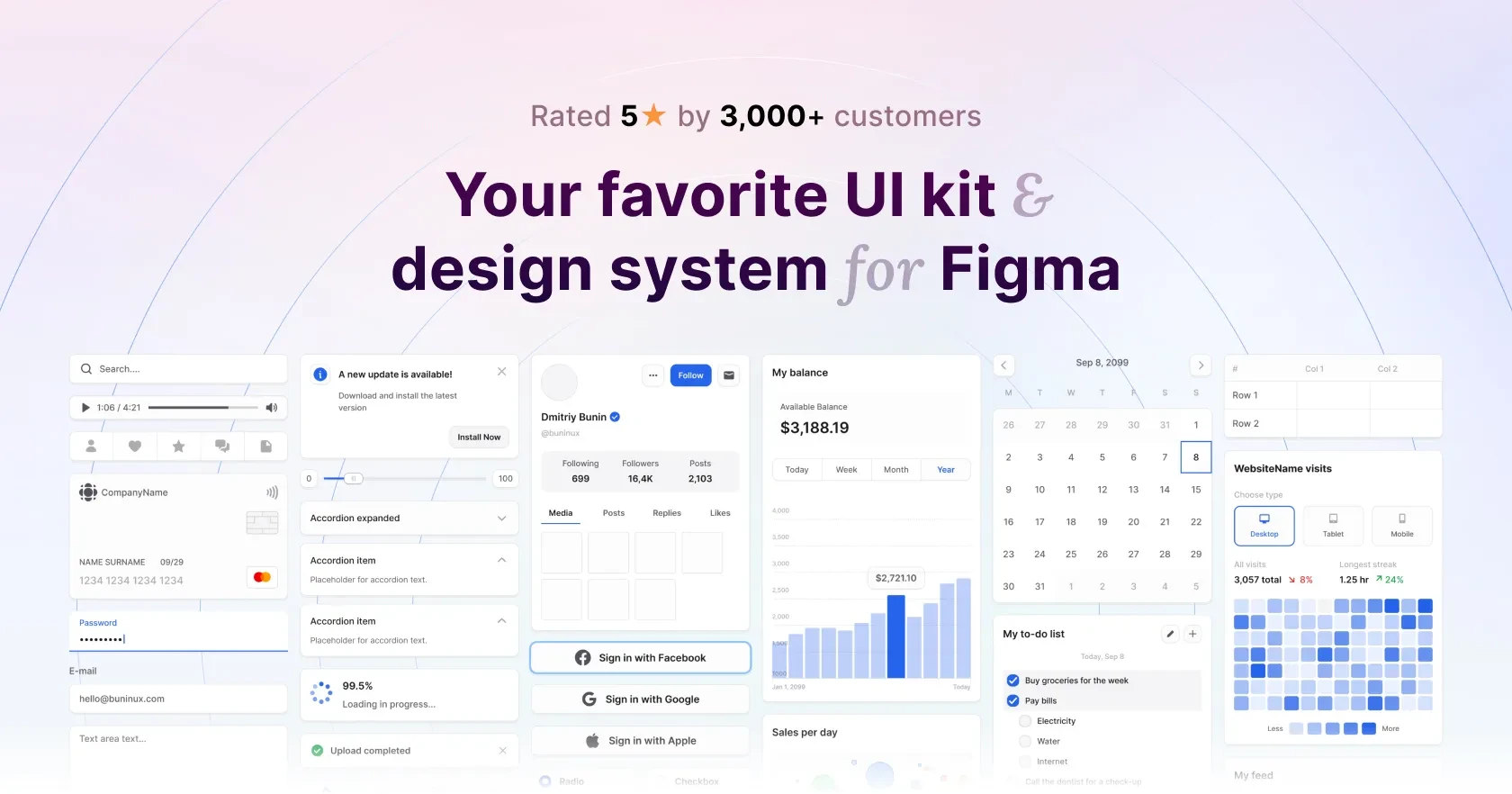
That's why we have created Frames X, a Truly Universal UI kit, to streamline your process. It is the largest and most advanced UI kit available for Figma in the world.
To learn more, click the button below or the Preview button.
Learning how to use Figma can be challenging, but it's definitely rewarding. Especially if you are a professional freelancer, developer, or part of a design team, mastering the best practices of the tool you're working with can help you achieve results much faster.
On this page, we've collected our favorite ever-lasting tips to help both beginners and advanced users get more from daily working with Figma. This is an ever-growing list, so bookmark ☆ it and revisit it occasionally for new tips.
Use the quick actions command menu
With the help of quick actions, you can access all available commands, plugins, and recently performed actions from the comfort of a single floating menu. To open it, use the following shortcut:
for Mac: ⌘ CMD + / or ⌘ CMD + P;
for Windows: Control + / or Control + P;
Navigate the results with ↑ or ↓ arrows on your keyboard;
Smash Enter / Return to execute the needed command.
Copy/paste properties with shortcuts
Use Option ⌥ + ⇧ Shift + C to copy layer properties from one object and then Option ⌥ + ⇧ Shift + V to paste them into another.
Optimize your nudge distance
Set a custom increment for your small and large nudges to move/align elements more quickly, with or without using SHIFT. Customize the nudge based on your daily tasks and save time on those small adjustments.
You can change the default nudge amount by using the Quick Actions CMD ⌘ + / and typing 'nudge';
You can also change it from the main menu in Figma, navigate to Preferences - Nudge amount.
Use shortcuts to navigate the layer structure
When trying to dig into a component or group of layers, we usually tend to spend time aiming for the right pixels to click.
Instead, 99% of the time, it's faster to use shortcuts to navigate the component or any group of layers on the canvas with a mouse-free approach. To do so, use the following shortcuts:
Enter to drill down through the Layers panel elements quickly;
Tab key to jump-navigate the list of layers from up to down;
⇧ Shift + Tab to return to a previous layer;
⇧ Shift + Enter to return to an upper level.
Use multi-select and multi-edit elements
Multi-select is a feature that allows you to align, make changes, and edit multiple identical objects at once.
When the Multi-select mode is activated, it searches for matching objects on the same levels of your design hierarchy that is selected, e.g., layer structure. The mode works for frames and variants, so you can take advantage of it when assembling and editing designs.
The best way to explain it is to try it.
Use the following shortcut: ⌘ CMD + ⌥ Option + A to activate the mode and select all matching objects.
When activated, you can use ⇧ Shift + Click to choose more layers that match the currently selected ones.
Note: When activated for multiple text layers, you can press Enter to edit multiple text contents.
You can also use Multi-edit mode to manage multiple component sets. Press Q when a component is selected to edit matching variants in the set.
Tag styles to find them faster
One of the most common things designers do when working in Figma is searching for styles and variables to apply to the selection.
Eventually, certain styles or variables become more frequently searched rather than others as the project matures.
To speed up this monotonous process and find needed styles faster, you can add a special symbol or use group names to filter styles and variables in Figma menus faster.
For example, the Frames X design system uses a '$ tag' (a String) to mark all primary and base elements, making them easier to access and use across files/projects.
Note: Use group names to find enclosing styles and variables. For example typing 'text' could reveal all available styles/variables applicable to text elements.
Use auto layout for dynamic elements
Adding auto layout to a group or a frame will override its default spacing values and make elements inside follow a specific direction and distribution order. The content will become sensitive to the Auto layout settings from the right sidebar.
To apply an auto layout, select a group or frame and use the keyboard shortcut ⇧ Shift + A to apply it. Or click + next to the Auto Layout label in the right sidebar.
Adjust auto layout flow for dynamic contents
When applied to a container, Auto layout can change the position and direction of nested elements.
Use Vertical direction to position elements on the Y-axis;
Use Horizontal direction to position elements on the X-axis;
Use Wrap to position elements in Z-order when elements move to the next line on contents resize.
Use variants to have fewer components
Variants in Figma help to outline multiple components to a single codependent structure.
Variants apply the Slash naming method to organize selected components and partition them into different subcategories or 'branches/types.'
Applying variants is recommended when a component switches between different states or has multiple variations, such as size, shape, or color.
Elements like buttons, inputs, and toggles are all perfectly fit for variants.
With variants, you can simplify the design system structure, reducing the number of components you need to maintain in the long run and contributing to the adoption of the design system.
Note: Not every component set should have variants. It would be best if you decided whether variants should be involved or not based on how somebody will operate the component you made. Here is a nicely written article on that particular topic.
Streamline changes with nested components
Nested components are structural elements that can help streamline changes to other components.
A nested component (A) is always within a component (B), so all B component variants stay in sync by utilizing component A instances, saving you time from manually updating each instance of B.
A nested component could also have the status of a Base component. This could be any element (icon, symbol, shape.), so instead of making variants for each component, you can use the base instances to make changes directly to the main component instances.
The most common example of a Base component is an icon component that is nested inside other components' variants.
For example, when working with multiple button variants, it could be beneficial to use a single Base Icon component that can be customized to fit any button type/variant.
Preserve component overrides
When making changes or 'applying overrides' to components, you may want to save changes applied to them before, such as preserving an icon color, nested element size, or specific variant.
Consider these 2 rules to preserve changes between components and variants:
To preserve changes between component layers, the structure and names of all layers inside should be identical;
To preserve variant properties, the names and hierarchy (properties and layer structure) must also match to preserve changes between similar or identical components.
Use component properties
Component properties are unique options assigned to an individual set of shared components.
Properties eliminate the need to create additional variants for every minor difference in a component set. Instead of redundant variants with minor differences, such as an extra icon, text, or specific detail, use Properties.
By identifying and assigning common properties to components, you can achieve better consistency in your component sets while managing fewer variants without sacrificing functionality.
To create a Property, select a nested instance or layer inside a component;
Click on The property icon '⎆' to apply the relevant layer property.
Use a consistent properties naming convention
Clear and consistent naming helps your project be more easily adopted and ensures the design-to-development process. It also helps preserve changes between variants, so don't overlook this important step for your Figma project.
Consider consulting with a developer for their input on the best way to name these dynamic options. Aligning your properties with your chosen dev stack will make things easier for your project lifespan.
Besides doing that, here are a few tips to help you set the naming:
Use the same names to describe the same properties/values across all of your components in your project;
Use the same naming convention as per the dev stack of your project. For example, Frames X uses default CSS names, as Default, Hover, Active, and Disabled for elements states;
Add a special symbol to properties that can reveal other properties. This will help identify more complex use cases making workflow with your designs more predictable;
For standard boolean properties such as Show/Hide icons or labels, use a symbol or short word (L, R, Top, Bot ) to indicate compactly which side or direction of the component an element will appear on;
Limit the amount of properties. Too many properties can make the component difficult to operate for the right purpose. If the component becomes overengenired with properties/states, consider identifying and creating variants to break down such components;
You can encounter numerous component to have nested items inside. Such as could be a menu or dropdown list. Use a consistent way to indicate nested items available in a component. Use a numeric scale. e,g. x1, x2, x3 to indicate the number of items/elements per nested instance;
Avoid using emojis for real projects. Their interpretation can often be subjective and unclear, and they can also make your designs harder to maintain.
Expose nested instances
Exposing nested instances is a helpful practice that gives you more control over your component sets. With exposing, you can access any nested instances included from the main (top-level) component.
To expose nested instances, select a component or variant set, click on + in the Properties panel in the right sidebar, and choose the Nested instances from the list.
Note: The option to expose nested instances is only available if the main component already has nested instances in it.
Use the quick insert menu
Insert components with your keyboard. Use the quick insert menu to search, drag and drop available components to your canvas.
Use ⇧ Shift + I to open the quick insert menu;
Use ⌥ Option + 2 to switch to the Assets panel.
Grab your teammates' attention
You can send a message from your cursor to quickly grab people's attention when pitching your ideas and decisions in Figma.
To enter the chat mod, deselect everything on the canvas and press '/' on the keyboard;
Press Enter/Return to clear the chat and type a new message.
Quickly find and replace text in Figma files
If you've lost a particular layer or want to quickly replace text layers.
Use the shortcuts CMD ⌘ + F on Mac and CTRL + F on Windows to trigger the search box UI and search your file for any available type of object.
You can further use shortcuts: CMD ⌘ + ⇧ Shift + D to see the previous result; And CMD ⌘ + ⇧ Shift + F to see the following result in the search list;
You can use the Replace command to locate any object names and replace them with others across pages.
Note: Under the Replace option, only text layers are displayed. If you search for an item that cannot be replaced, such as a variable or style, no results will be displayed.
Use dividers to arrange pages in the file
As the project grows, so does the file, with many pages becoming harder to track.
Divide pages into sections or categories with dividers to speed up the process of navigating to the right page.
To add a divider, click on the + icon in the left panel. Or create a new page and type '---' as the page name.
Manage files' memory usage
When a Figma file becomes bloated and slow, it can be a real pain for a project. There are several hacks to apply to solve this issue.
When using components from different sources in one file, they can sometimes 'Lag' and display a wrong layout. To fix this, use the 'Regenerate all instances (slow)' command from the Quick Action menu.
Clear unused imported or deleted components. Sometimes, the components that we have been using in our files can continue to consume memory after the deletion. To solve this and remove these 'ghost" components and layers completly, use the 'Compute publish status of soft deleted components' command from the Quick Action menu.
To clear the Figma cache and refresh the memory usage of the opened tabs, Click Help in the top menu bar. Then go to Troubleshooting > Clear cache and restart.
Learn more basic tips from the Figma' officials guide.
Use a ready-made UI kit to speed up your workflow
The best way to speed up your design process in Figma — is to use a UI library or a design system kit that has everything pre-built in.
A good UI kit will help you find solutions to your design problems much faster and simplify your team's life without undergoing a long process of designing everything from scratch. Sounds good, right?
But, a good UI kit is hard to find, with many solutions built solely for decorative or inspirational purposes.
That's why we have created Frames X, a Truly Universal UI kit, to streamline your process. It is the largest and most advanced UI kit available for Figma in the world.
To learn more, click the button below or the Preview button.
⟡
⟡
⟡